Class Description
Watercolor Workshop
Instructor: Anita Lehmann
Class Dates: December 9-20, 2025
7 Video Lessons + a Special Zoom Session!
On sale for $59.
Hello!
Every once in awhile we like to re-run our most popular classes to introduce them to new students and also give those who took them the first time around a chance to revisit the lessons and interact with the instructors again.
We are excited to announce that we will be re-running Anita Lehmann’s WATERCOLOR WORKSHOP from December 9-20, 2025! In addition to revisiting the six video lessons together, there will be a special Zoom Session on the last day of class, Saturday, December 20th. There Anita will give us a new watercolor assignment, time to work on it and ask any questions, and then you will have the opportunity to share your work with people from all over the world. We hope you will join us!
If you’re new, SIGN UP TODAY with the discounted price of $59!
If you’ve previously taken the class, you can join again at no cost, but you need to SIGN UP AT THIS LINK to get on the re-run class email list! (Not sure if you already have this class? Check your class account!)
Within a few days of signup, you will receive an email with all of the details. Thanks so much again!
Carla
_____________________________
CLASS DESCRIPTION
Dear Creative Adventurers:
In seven creative sessions we will develop an understanding of transparent watercolor, discover its characteristic four variables and work with the beauty of the paint. Whenever I work with watercolor I am excited to see where the paint takes me!
Painting with watercolor has its challenges, and in this class I’ll share “cut-to-the-chase” techniques for making vibrant and expressive pieces. We will try to eliminate some of watercolor’s challenges: muddy paint, weak colors, paintings overworked, feeling a lack of control, or too many colors to manage. These step-by-step lessons begin with getting comfortable with your tools: paint, water, a few brushes and paper. We will investigate properties of color, color strategies and working with color’s key partner “value.” Awareness in watercolor’s four variables will be presented to simply break down the thinking process while painting: wetness, composition, value and color.
A must-have class for your mixed media toolbox… The adventure begins. Let’s paint!
Anita
Immediate Access
Lesson 0 – Supplies
Hello + Welcome. Brushes, paints, colors, papers, oh my. Time to set up. Squeeze out those colors (a lot). Get organized. Get ready to paint and “fall in.”
Week 1
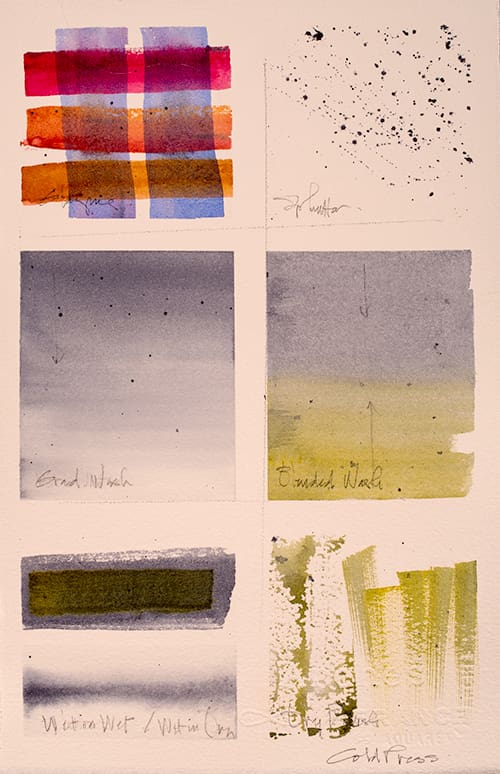
Lesson 1 – Watercolor Samplers, Marks and Washes
Let’s make marks and experiment with creative brush strokes. The many washes, blends, splatter, and glazes are great to practice — every day — until you are familiar. The hot and cold press papers present different outcomes. See which you prefer. Use the water to clean your brush, mostly. Remember small ‘water’ and big ‘COLOR’.
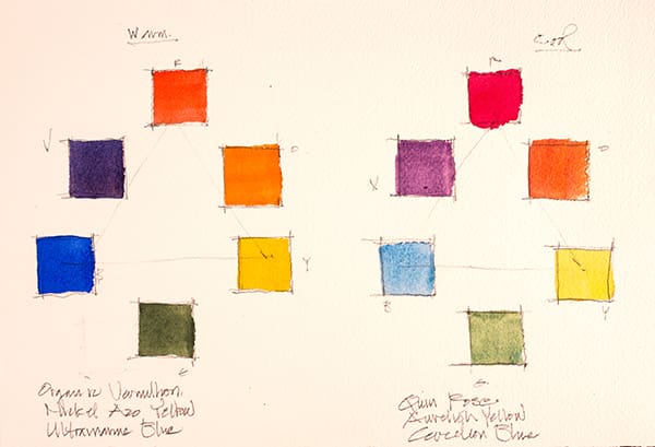
Lesson 2 – A Color Wheel, Color mixing and expanding your palette
We are set to go with color. Mixing, blending and folding are the actions here. Let’s play with your warm colors: Ultramarine Blue, Vermillion Red, Nickel Azo Yellow, and cool palette: Cerulean Blue (Colbalt Blue option), Quinacridone Rose, Aureolin Yellow and see the endless value and color combinations. A color wheel introduction with Color Mixing will give us primary and secondary colors, beautiful and so simple. Discovering neutrals by mixing complements is rewarding and eye-opening. Obtaining darks in watercolor is key. These lessons are great to repeat a few times. Each time you will become more familiar with water vs. color proportions. Did I mention, (small) water– (big) COLOR? Let’s make this about color.
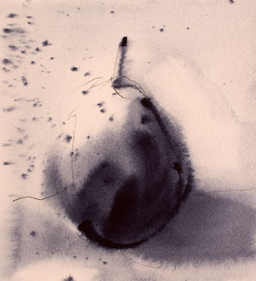
Lesson 3 – Value: the worker bee + a few Edges + Wetness
Meet, your new best friend: value. In this lesson, we will re-discover ‘value’, one of the four key variables in watercolor. This value scale will be mixed, keeping in mind skim milk, whole milk + yogurt paint proportions, working from light to dark. This new friend, your value scale, can partner with you always whenever you are creating watercolor paintings. Another key variable in watercolor is edges/wetness: discovering hard and soft and rough edges, when to have either or more? Each time I place my brush my onto the paper, am I wishing for a soft or hard edge? How wet is my paper and how wet is my brush? Did I let the paper dry? How dry? How wet?
Week 2
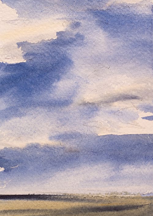
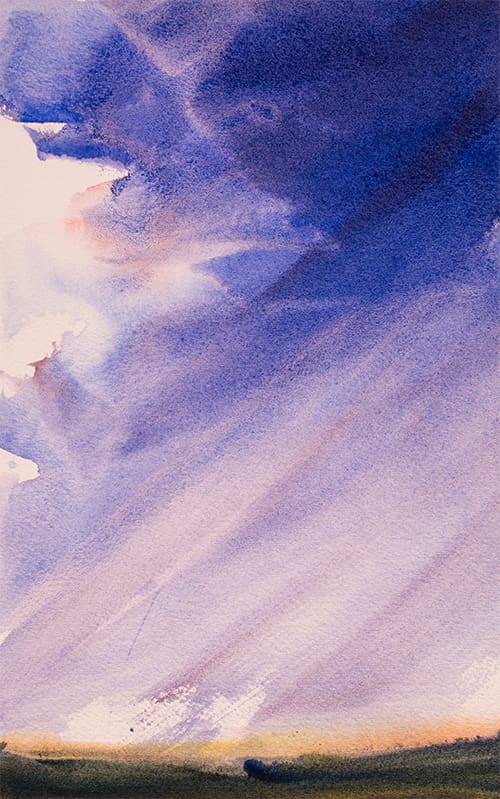
Lesson 4 – Skies: Atmosphere and Light
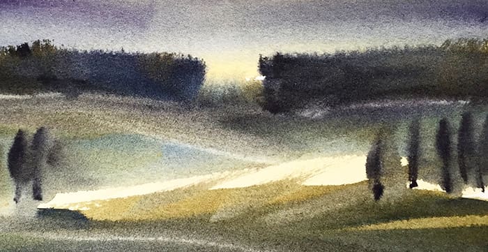
Let’s create an atmosphere, a place in time. At times I call this the ‘Tinkerbell’ light of the painting. Typically, I work from light to dark and ask myself, ‘What mood/feeling’ do I want in this painting, be it a landscape or still life. Skies and backgrounds can certainly create a mood: dramatic, quiet, soft, windy, morning or evening. Create 4-6 emotive, atmospheric works evoking light and feeling.
Lesson 5 – Value in the Landscape and a few tree shapes
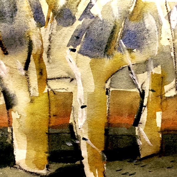
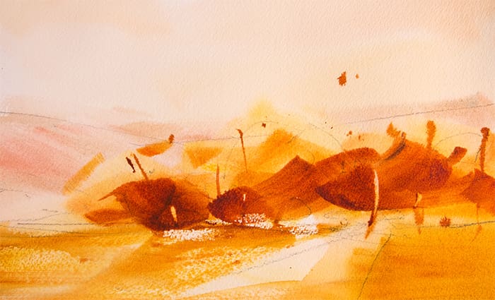
More about Value. Let’s put these concepts together: shapes, edges, values, skies: You are painting with gusto, now. In painting trees, I am always switching to my right side of my brain and think ‘tree – shape’, be it conifer, deciduous, oval, vertical, orchard trees etc. Thinking is shapes, keep you staying abstract as long as possible, and so important in art practice. Let it become a tree or collection of tree-shapes on its own. With a bit of practice, this will happen. Saying less, with a fewer strokes, please. Then add those very few key marks to define. Less is more.
Week 3
Lesson 6 – Color Strategy + Limited Palette in the Landscape
It so important to have a select color strategy in which to begin a painting. This process simplifies your choices, but also conveys a ‘mostly’ in color, as well as a feeling/mood in the artwork. Our first approach is an Analogous painting; those colors next to each other on the color wheel. Study your color wheel and locate the colors you wish to use in this first painting. Stay strict to your choices. I love this process, as I can focus more on ‘painting’ and fall into my right-brain more readily. Follow your initial, value study landscape for clues discovered in that painting for this exercise. Our second approach will be a Warm/Cool Painting. Your warm-cool color choices are opposites in the color wheel. Additionally, in this painting strategy, define a ‘Mostly’ and stick with it: mostly warm or mostly cool? Again, stay strict to your choices. Review each painting strategy. Which do you prefer?
Lesson 7 – The Watercolor Variables: Wetness/Edges + Composition + Value + Color
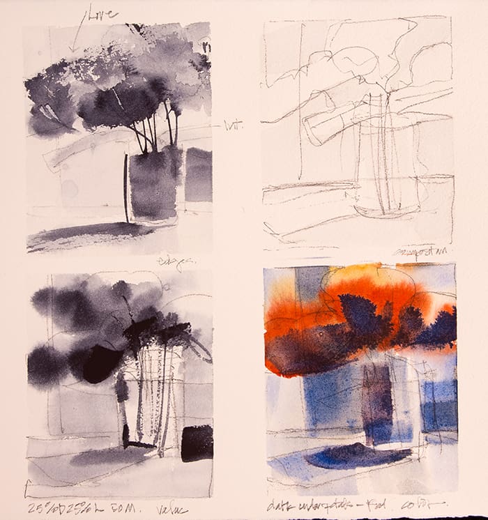
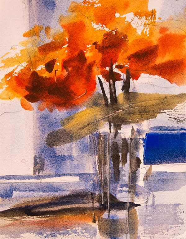
Now we will combine these past six lessons and paint a still life, an easy set-up with simple shapes: I used flowers and a vase on a table. We’ll start with a watercolor variable study and divide our paper into the four separate design fields. Label each and begin the process of breaking down in diagram the checklist of watercolor concepts: Wetness/Edges, Composition, Value and Color. Then we will put it all together for your final painting.
