
Lesson 4 – Collage & Cut Paper
Lesson 3 – Design the Spine
Lesson 2 – Paper Weaving & Embroidery
Lesson 1 – Shaping Our Book Cover
Lesson “0”
March – Improvisational Drawing
Week #4
Week #3
Week #2
February – Pattern!
Week #1
January – Working in Series
Class Forum Links
Special Zoom Session!
Special Zoom Session!
Lesson 5 – Folding Door with Tabs Contraption, Part 2
October, November & December
Lesson 4 – Folding Door with Tabs Contraption, Part 1
Lesson 3 – Wheel Contraption, Part 2
Lesson 2 – Wheel Contraption, Part 1
Lesson 1 – Sliding Pull Contraption
Lesson 6 – Complementary Colors Paintings
Lesson 5 – Color Field Paintings
Lesson 4 – Collage Color Pie Graphs
Lesson 3 – Neutrals & Muted Colors
Lesson 2 – Value
Lesson 1 – Hue
Lesson 5 – Finishing Our Larger Pieces
Lesson 4 – Blotted Line Technique; Begin Larger Piece
Lesson 3 – Carving Stamps, Details & Finishing Touches
Lesson 2 – Begin Some Smaller Collages
Lesson 1 – Gathering and Making Collage Materials
July, August & September
Lesson 6 – Line Work & Final Details; Bonus Production Video
Lesson 5 – Adding Color
Lesson 4 – Penciling Step
Lesson 3 – Storyboarding
Lesson 2 – Make a Dummy
Lesson 1 – Sketchbook Brainstorming
Lesson 5 – Collage, Paint, Draw, Finish!
Lesson 4 – Making a Sentence
Lesson 3 – Making Visual Words
Lesson 2 – Layering
Lesson 1 – Gel Plate Basics
April, May & June
Lesson 6 – Floating Elements for Fun & Profit
Lesson 5 – Pickles & Problem Solving
Lesson 4 – Popcorn Hierarchy
Lesson 3 – Draw What You Know (Not What You See)
Lesson 2 – Process Over Everything in the Whole Wide World
Lesson 1 – Get a Grip!
Lesson 5 – Mixed-Media Finishes
Lesson 4 – Start a Bigger Painting
Lesson 3 – Developing the Compositions
Lesson 2 – Inking Techniques
Lesson 1 – Watercolor Backgrounds & Mark-Making
Lesson 5 – Head & Shoulder Portraits
Lesson 4 – Adding Bodies
Lesson 3 – Making Faces
Lesson 2 – Drawing Facial Features
Lesson 1 – Cut Out & Play
January, February & March
List of PDFs
Six 2024 “Talk & Draw” Sessions with Guest Artists
Happy New Year 2025
Session 5 – Asemic Writing Send Off!
December – Recipes + Collaborative Cookbook
Lesson 5 – Patterns & Finishing
Lesson 4 – Backgrounds
Session 4 – Anato-Me
Lesson 3 – Moving Towards a Book
Lesson 2 – Adding Figures
Lesson 1 – First Shapes
November – Handmade Books
Lesson 5 – Finish Three Paintings
Lesson 4 – Continuing Painting
Session 3 – I Saw Journal
Lesson 3 – Block Out Our Compositions
Lesson 2 – Add Story
Lesson 1 – Sketch with Reckless Abandon
Session 2 – Shut Up!
October – Maximalism: More Is More!
Lesson 5 – Perfecting Your Imperfection
Lesson 4 – Making Sense of the Mess
Lesson 3 – Tell Your Story
Lesson 2 – Make Your Mark
Lesson 1 – Practice Noticing
Session 1 – Intro + Extraterrestrial Diary Project
September – Collage!
August – Journal Mining Continued!
Lesson 6 – Trifold Book (Part 3)
Lesson 5 – Trifold Book (Part 2)
Lesson 4 – Trifold Book (Part 1)
Lesson 3 – Card Book with a Flap (Part 2)
Lesson 2 – Card Book with a Flap (Part 1)
July – Journal Mining
Lesson 1 – Repetition & Variation Accordion Book
Lesson 6 – Gold Leaf
Lesson 5 – Finishing Details
Lesson 4 – Refining
Lesson 3 – Blocking in Color
June – “Useful” Paper Maché + Collaborative ‘Zine
Lesson 2 – Composition
Lesson 1 – References & Background
Lesson 6 – Finishing
Lesson 5 – Planning & Painting
Lesson 4 – Polymer Clay
Lesson 3 – Creating Boxes
Lesson 2 – Adding Elements
Lesson 1 – Preparing Your Tin
May – Blue
Lesson 6 – The Final Touches
Lesson 5 – Putting It All Together
Lesson 4 – Introducing Muslin
Lesson 3 – Creating with Cut Paper
Lesson 2 – Adding Pattern
Lesson 1 – Creating Background Papers
April – Every Drawing Exercise I Have Ever Taught and a Few I Haven’t (Yet)
Lesson 6 – Finishing Touches through Mixed Media
Lesson 5 – Full-On Watercolor
Lesson 4 – Timed Lines, and Expressive Watercolor
Lesson 3 – Value and Texture
March – Outsider Art
Lesson 2 – Lines
Lesson 1 – Reference Photos, Perspective, and Textures
Lesson 6 – Accents and Finishing
Lesson 5 – Stenciling
Lesson 4 – Making Stencils
Lesson 3 – Creating Sections
Lesson 2 – Brayer Layers
Lesson 1 – First Layers
February – Grids!
January – Read, Write, Draw!
Lesson 24 – December Zooms – End of the Year Share Party!
Lesson 23 – Mixed-Media Rabbit Paintings
Lesson 22 – November Zooms – Artist Book Work Session
Lesson 21 – Abstract Comics (with Plots!)
Lesson 6 – Evaluation and Finishing Touches
Lesson 5 – Printing Our Collagraph Plates
Lesson 4 – Collagraph Plate Preparation
Lesson 20 – October Zooms
Lesson 3 – Printing Our Drypoint Plates
Lesson 2 – Drypoint Plate Preparation
Lesson 1 – Six Base Monotypes
Lesson 19 – Shaped Paintings (+ the Placeholder Lesson!)
Lesson 6 – Bringing It Home
Lesson 5 – Layering an Image on Top
Lesson 4 – Starting Our Main Drawing
Lesson 18 – September Zooms: Artist Book To-Do List
Lesson 3 – Get Your Head in the Clouds!
Lesson 2 – Color on Color!
Lesson 1 – Three Exercises
Lesson 17 – The 6-Minute Booklet ‘Zine
Lesson 16 – August Zooms: Fold-Out Animal Pages
Lesson 15 – One-Liner Rabbits & Lacy Lions
Lesson 14 – July Zooms: Collaborative Drawings
Zoom Session 4
Zoom Session 3
Zoom Session 2
Zoom Session 1
Lesson 13 – Charcoal Bunnies & Sprayed Bouquets
Zoom Work Session Recording
Lesson 12 – June Zooms; Sewing in Our Books
Lesson 6 – Finish the Third Painting
Lesson 5 – Begin the “All-Over” Painting
Lesson 4 – Paint!
Lesson 3 – Start the Second Painting
Lesson 2 – Paint!
Lesson 1 – Drawing Flowers From Life
Lesson 11 – Wrap a Rabbit, and Photograph!
Lesson 10 – May Zooms – One-Page Sampler: Watercolor +
Lesson 6 – Finish Your Painting
Lesson 5 – Honing In
Lesson 4 – Next Layer
Lesson 3 – Backgrounds
Lesson 2 – First Layers
Lesson 1 – Drawing Your Pet: Grid Technique
Lesson 9 – Watercolor Techniques + Podcast Pages
Lesson 8 – April Zooms: Artist Books – Add, Subtract, Multiply & Divide
Lesson 6 – Spirit House Finish
Lesson 5 – Spirit House Cont.
Lesson 4 – Starting Your Spirit House
Zoom Work Session
Lesson 7 – Erased Rabbits, Photo Montage Paintings & ATC Swap
Lesson 3 – Dream Bubbles
Lesson 2 – Scrappy Blablahs
Lesson 1 – Making Papers!
Lesson 6 – March Zooms: Drawing from Props, Rubber Cement Resists, and Staplers!
Lesson 6 – Finding a Story
Lesson 5 – Imaginary Monsters
Lesson 4 – Sandwich Illustration
Lesson 3 – Repeated Object
Lesson 2 – Imaginary Plants
Lesson 1 – Icons from a Single Shape
Lesson 5 – Alcohol Inks, Part 1: Haiku Rabbits & Bleed-Through Booklet
Lesson 6 – Finishing Touches
Lesson 5 – Keep Nudging Your Drawings Forward
Lesson 4 – Begin the “Chaotic” Drawing; Take Grid Further
Lesson 4 – February Zooms: Meditative & Mini Drawings, Pockets, Bind Book, Painting Demo
Lesson 3 – Begin the Grid Drawing
Lesson 2 – Finish Your Drawings
Lesson 1 – Begin Two Smaller Drawings
Lesson 3 – Altered Papers + Color Block Collages
Lesson 2 – January Zooms: Picasso Rabbits, Prepare Pages, Fuzzy Bunnies
Class Info
Lesson 1 – Draw the Rabbit + Gelli® Plate Pages
Lesson 12 – Chasing Iguanas with Carla
Lesson 6 – Details & Finishing Touches
Lesson 5 – Paint the Big Shapes
Lesson 11 – Fashion-Inspired Drawings with Anne Marie Grgich
Lesson 4 – Composition & Structure
Lesson 3 – Adding the Figure & Color Mixing
Lesson 2: Symbols Exploration
Lesson 1: Explore Mood with Color & Shape
Lesson 7: Finishing Touches: Mark Making, Additional Layers + Letting it Be
Lesson 6: Printing Color with Layers, Opaque/Transparent Inks + Stencils too.
Lesson 5: A Color Wheel: Hue, Value + Intensity
Lesson 10 – Abstract Constructions with Anna Macrae
Lesson 4: Sampler in Landscape Design: Design Elements
Lesson 3: Draw Downs + Printing in Layers
Lesson 2: An Additive Process + Trace Monotype
Lesson 1: Getting Started: Subtractive Process + Ghost Prints
Lesson 6 – Portrait
Lesson 5 – Color Collage
Lesson 4 – Black & White Collage
Lesson 3 – Preparing Collage Papers
Lesson 2 – Wet Media
Lesson 1 – Dry Media
Lesson 9 – Collage Illustrations with Andrea D’Aquino
Lesson 8 – Paper Quilts with Julie Paschkis
Lesson 6 – Going Big
Lesson 5 – My House Dollhouse
Lesson 7 – Unmask-o-Rama with Henrik Drescher
Zoom Session
Lesson 4 – Adding Animals
Zoom Session
Lesson 3 – Adding Figures
Lesson 2 – Moon Paper Transparency Collages
Lesson 1 – Two Sketchbook Exercises: Finding Your Preferences
Lesson 6 – Applying the Features
Lesson 5 – Drawing Features & Third Layer
Lesson 4 – Second Layer & Hanging Hooks
Lesson 3 – Editing Your Form; First Paper Mache Layer
Lesson 2 – Wire, Crumpled Paper & Masking Tape
Lesson 1 – Sketch Your Design & Make the Paste
Lesson 6b – Paper Cutting with Yvetta Fedorova
Lesson 6a – Brainstorming with Your Hands with Scott Menchin
Lesson 6 – Picture-Making
Lesson 5 – Animate!
Lesson 4 – Bring Story to a Close
Lesson 3 – Introduce Color
Lesson 2 – Start Drawing
Lesson 1 – Bind Your Notebook
Video Archive & Forum Links
Lesson 5 – Where Do You Live? with Selina Alko
Lesson 4 – Pastel Portrait & Foldout Book with Wing (Hu Yong Yi)
Lesson 6 – Adding Collage & Textures
Lesson 5 – Adding Color
Lesson 4 – Creating a Reference
Lesson 3 – Digital Collaging
Lesson 2 – Digital Line Work & Shading
Lesson 1 – Scan & Adjust an Analog Drawing
Lesson 3 – A Series of UN-Masterpieces with Stacy Milrany
The Frog Princess – Lesson 2
The Frog Princess – Lesson 1
Lesson 5 – Final Touches
Lesson 4 – More Painting!
Lesson 3 – Paint!
Lesson 2 – Drawing On Our Boards
Lesson 1 – Sketchbook Warmups
Lesson 2 – Painting & Collage with Katherine Streeter
Lesson 1 – Stickers & More with Starheadboy
Carla’s Intro (“Map”)
Welcome Info
Lesson 24 – Draw from Life!
Lesson 23 – Guest Artist Sarah Simon
Lesson 22 – Textured Drawings
Lesson 6 – Final Piece
Lesson 5 – Final Sketches
Lesson 4 – Mind Mapping & Thumbnails
Lesson 3 – Color Studies & Shading
Lesson 2 – Posing Your Character
Lesson 1 – Finding Your Character
Lesson 21 – Guest Artist Laurie Rosenwald
Lesson 6 – The Cover
Lesson 5 – Addressing the Blank Page
Lesson 4 – Wet Media
Zoom Session
Lesson 3 – Pen Play
Lesson 2 – Binding
Lesson 1 – Gather Your Papers
Lesson 20 – Acetate!
Lesson 19 – Guest Artist Julie Paschkis
Lesson 6 – Finishing Our Portraits
Lesson 5 – Lightbox
Lesson 4 – Slowly Building a Portrait
Lesson 3 – Frankensteining a Portrait Together
Lesson 2 – Choosing Reference and Practice Makes Perfect
Lesson 1 – Intro and Purposeful Doodling
Lesson 18 – Ethan’s Accordion Book Structure
Lesson 17 – Guest Artist Michèle Landsaat
Lesson 16 – Crayons!
Lesson 15 – Guest Artist Dianne Jenkins
Lesson 5 – Picasso Dogs
Lesson 4 – Inside Out: Foldable Surprise Drawing (with Libya)
Kids Art Week 2021 – Lesson 2 – Taped Rainbow Animals
Lesson 14 – Photo Paintings
Kids Art Week 2021 – Lesson 3 – Sidewalk Crack Collage with Nelleke
Lesson 1 – Folded Critter-Puppets with Luna
Lesson 13 – Guest Artist Nino Yuniardi
Lesson 6 – Connecting the Dots (Dancers)
Lesson 12 – Drawings for Your Collage Pile!
Lesson 5 – Frankenstein Pens & Godzilla Markers
Lesson 4 – The Seeds Blossom
Week 13
Week 12
Week 11
Week 10
Week 9
Week 8
Week 7
Week 6
Week 5
Week 4
Week 3
Week 2
Lesson 3 – Binding Your Seeded Notebook
Lesson 2 – Seeding Your Notebook
Lesson 1 – Collage Material
Lesson 11 – Guest Artist Foremost
Lesson 10 – Using the Patterned Papers!
Lesson 6 – Still Life: The Evocative
Week 1
Lesson 5 – Still Life: The Depictive
Lesson 4 – About the Sphere: Volume & Light
Lesson 9 – Guest Artist Clare Youngs
Lesson 3 – Shape & Volume
Lesson 2 – True Horizontals & Verticals; Diagram Drawings
Lesson 1 – Line: Upside-Down & Blind Drawings
Lesson 8 – Embracing “Ugly” and Clashing Colors
Lesson 7 – Guest Artist Pam Garrison
Video Archive & Forum Links
Zoom Link & Details
Lesson 6 – All-Day Challenge
Lesson 5 – Guest Artist Camilla Engman
Lesson 6 – Finishing Your Grid Drawing
Lesson 5 – Starting a Grid
Lesson 4 – Organic Subjects
Lesson 4 – Experimenting!
Lesson 3 – Shading
Lesson 2 – Composition & Balance
Lesson 1 – Introduction & Getting Started
Lesson 3 – Guest Artist Henrik Drescher
Lesson 2 – Della Wells & Dolls
Zoom Recordings
Lesson 1 – Family Portraits
Week 3 – Finishing Touches and Finishing Up
Week 2 – Adventurous Stitches with More Complexity
Lesson 22 – Carla; Graphic Novel
Week 1 – Let’s Begin! Warping the Loom, Color Blocking, Recycled Materials & More
Lesson 21 (Part 2) – Greg + David; Pictureless Comics
Lesson 21 (Part 1) – Greg + David; Poetry Comic
Lesson 20 (Part 2) – Greg + David; Adding Story
Lesson 5 – Mud. Splat. Tarantula.
Lesson 4 – Make Your Own Butterfly Collage
Lesson 3 – Simple Flying Bugs with Hazel Terry
Lesson 20 (Part 1) – Greg + David; Creating Some Comic Characters
Lesson 2 – Pop-Up Bug World with Cara Rooney
Lesson 1 – Flying Insects + Imaginary Bugs
Lesson 6 – Varnish Your Painting
Lesson 5 – Finish Your Painting
Lesson 4 – Paint Your Sky
Lesson 3 – Create Your Composition
Lesson 2 – Painting Collage Papers
Lesson 1 – Surface Preparation
Lesson 19 – Austin + Allan; Graphic Novels + a Writing/Visualization Exercise
Lesson 7 – The Watercolor Variables: Wetness/Edges + Composition + Value + Color
Lesson 6 – Color Strategy + Limited Palette in the Landscape
Lesson 5 – Value in the Landscape and a Few Tree Shapes
Lesson 18 – Brandon, Favorite Things ‘Zine
Lesson 4 – Skies: Atmosphere and Light
Lesson 3 – Value: the Worker Bee, Edges + Wetness
Lesson 2 – A Color Wheel, Color Mixing and Expanding your Palette
Lesson 1 – Watercolor Samplers, Marks and Washes
Lesson 17 – Ozge, Stories from Photos
Today’s Prompt (September)
Lesson 16 – Ozge, Single-Panel Cartoons
Lesson 15 – Carla, Research Accordian Book
August Prompts (Archived)
Lesson 5 – Basquiat-Inspired Self Portraits
Lesson 4 – Cut Paper Puzzle Paintings
Lesson 3 – Inside Out: Foldable Surprise Drawing
Lesson 2 – Collagraph Fish
Lesson 1 – So Easy Rock ‘n Roll Guy ‘n Girl
Lesson 6 – Della Wells
Lesson 5 – Lewis Rossignol
Lesson 4 – Liz Tran
…
Lesson 3 – Mystele Kirkeeng
Lesson 2 – Jenny Sue Kostecki-Shaw
test
Lesson 1 – Aram Kim
July Prompts (Archived)
Lesson 14 – Carla, Folded Books
Lesson 13 – Sarajo, Graphic Poster
Lesson 12 – Sarajo, Lettering + Flyers
The Lessons
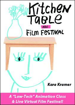
Watch the Film Film Festival
Watch the Film Festival!
Lesson 11 – Portraits with Carla; Writing with Jason
Lesson 6 – From Storyboard to Animation
Lesson 5 – Ideas & Storyboards
Lesson 4 – Faces
Lesson 3 – Collage Bits
Lesson 2 – Line, Dot, Scribble!
Lesson 1 – Set Up and Spiral
Lesson 10 – Face Time
Lesson 10 – Kara, Messy Notebooks Part 2
Lesson 9 – Mixed-Media Narrative Painting
Lesson 8 – Cheater Blinds + Google Earth
Lesson 7 – Flower Portraits
Lesson 6 – Blind Contours + Junk Mail Book
Lesson 5 – Wrong Hands + Junk Mail Book
Lesson 9 – Kara, Messy Notebooks
Lesson 4 – Textures, Blobs + Crazy Birds
Lesson 3 – Drippy Animals + Junk Mail Book
Lesson 2 – Taking the Lions Further
Lesson 1 – Roar!
Lesson 1 – TEST
Lesson 8 – Carla, Ballpoint Art (+ Beth)
Lesson 6 – Details, Wax Crayons and Dorlands Wax
Lesson 5 – More Layers
Lesson 4 – More Paint
Lesson 7 – Cat + Bari, Sketchbooks + Bookbinding
Lesson 3 – Pens and Washes
Lesson 2 – White Incise Layer
Lesson 1 – Prepare Your Canvas; Drawing Exercise
Lesson 6 – Susy, Bringing it Together
Lesson 6 – The Composition Editing Process
Lesson 5 – Susy, Warm-Up & Recipe
Lesson 5 – Variety, in More Detail
Lesson 4 – What Creates Unity
Lesson 3 – Begin with Value
Lesson 5 – Haiku Drawings
Lesson 4 – Right Person, Wrong Hand
Lesson 3 – Chicken!
Lesson 2 – One Liners
Lesson 1 – Blind Contour Polar Bears
Lesson 2 – Unity and Variety, Grids
Lesson 4 – Carla, Words IN Pictures (+ Andrea)
Lesson 1 – Painting Papers
Lesson 3 – Martha, Found Word Paintings
Lesson 2 – Martha, Horror Vaquii (Drawing)
Lesson 1 – Carla, “Impossible”
Lesson 6 (Anne) – To the Finish Line
Lesson 5 (Anne) – Working Towards Near Completion
Lesson 7 – Paint Like Crazy
Lesson 6 – Edit
Lesson 5 – Design
Lesson 4 – Recipe
Lesson 3 – Mapping & Brainstorming
Lesson 2 – Field Sketching
Lesson 1 – Collect & Gather
Lesson 4 (Anne) – Take Stock and More Layers!
Lesson 6 – Simple Character Accordion Book
Lesson 5 – Letters
Lesson 3 (Anne) – Transparencies and More
Lesson 4 – Things
Lesson 3 – Animals
Lesson 2 – Bodies
Lesson 1 – Faces
Lesson 2 (Anne) – Accordion Book/Working the Vessels
Lesson 1 (Anne) – Collect, Sort and Begin
Cut Paper Collage – Organizing Your Collage Scraps
Hello Everyone!
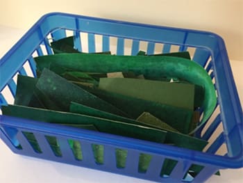
Thank you so much for all your lovely posts and all your childlike enthusiasm for collage! This is a supplemental message of creative camaraderie for you! But also a little something I forgot about when we were filming. 🙂
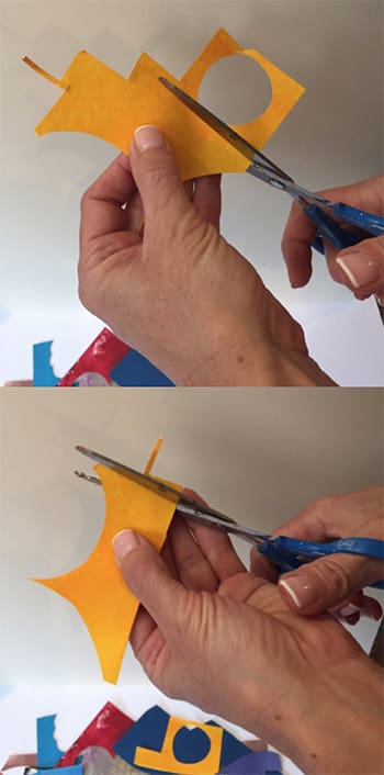
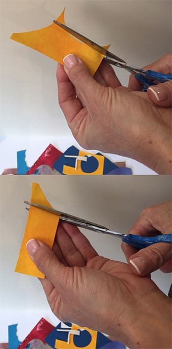
In Lesson 4, I refer to how I take care of my scraps to keep them tidy. Now, if you don’t care about having a tidy box of cut scraps, please do not give any of this a second thought. You might have noticed by now that I have some Type A tendencies that come out in my art and my workspace is no exception. Haha.
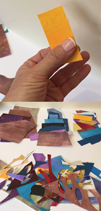
So, if you have a big pile of cut scraps, you might find them hooking together where they’ve been cut, mixed up by size and by color, and this might make them less appealing to use. This is a way of organizing them that is so simple—and perhaps obvious— but that works for me in two ways. First, it is often a good way to “begin” in my studio. We all face the creative block and often I find that a little studio tidy-up can be just the thing for getting back into my creative groove. Giving all my scraps a clean-up trim is often just the thing I need to want to start touching all my supplies and make something beautiful again. Second, it is a way for me to put my palette back together and it gives the scraps a newness/freshness that sets me up for a new composition in an organized way.
Again… if this is not what you need, please carry on!
It’s really about putting your scraps back into the basic shapes—usually some form of a rectangle— and taking off the bits that hook together and make the “pile” kind of a mess to sort through as a palette. So, all you do is trim off scrappy pieces that are too small to use, although you could even save these and turn them into little “mosaic” like collage pieces. I even break mine down into color and size. Here you can see a little bin of trimmed, green scraps, which I use a lot for all the leaves I cut. I never know when I’ll need another little piece of something, so I don’t part with much. You can see how we went from a big, jumbly pile to neat stacks of rectangles.
This is also a really great “job” to give children. 😉
Yours In Creative Organization,
Dar
Lesson 5 – Packing Tape Animals
Lesson 4 – Find a Bird In It
Lesson 3 – Sidewalk Crack Collage (with Nelleke!)
Lesson 2 – Sidewalk Story Book
Lesson 1 – Sidewalk Cracks!
Lesson 6 (Lynn) – Final Collage!
Lesson 5 (Lynn) – Simplicity and the Potted Plant
Lesson 6 – The White Hug
Lesson 5 – Detail Day
Lesson 4 – The First Layer of Color
Lesson 3 – Drawing and Inking
Lesson 2 – Papering the Cradles
Lesson 1 – Finding your Face and Pen Nib Handling
Lesson 4 (Lynn) – Windows and Cut-Outs
Lesson 6 – Finishing Your Paintings
Lesson 5 – Bringing Your Series Into Focus
Lesson 3 (Lynn) – Shaking the Snow Globe!
Lesson 4 – Outlining, Smooshing & Self-Leveling Gel
Lesson 3 – More Acrylic Paint; Color Mounds
Lesson 2 – Pens, Markers, Patterning
Lesson 1 – Draw and Color Washes
Lesson 2 (Lynn) – Color Wheel Portraits
Lesson 6 – Subtle Elements: Using Line and Finishing Touches
Lesson 5 – Working with Photography and Title Text; Visual Weight
Lesson 1 (Lynn) – Value Mosaic Faces
Lesson 4 – Loosening up!
Lesson 3 – Deconstructing Hardbacks, Exploring Shape
Lesson 2 – Using Line Art Illustrations and Text
Lesson 1 – Deconstructing the Paperback; First Collages
Lesson 6 – A Master’s work and one of our own: Notes to self
Lesson 5 – Interior (Still Life) Space
Lesson 4 – Discovering Composition in Working Drawings
Lesson 3 – Composition with Paper Shapes & Value
Lesson 2 – A Powerful Foundational Grid
Lesson 1 – Musical Response & Felt Responses
Lesson 6 – Going Big
Lesson 6 – The Book of the Interior
Lesson 5 – Flip It!
Lesson 4 – Step by Step: Let’s Take a Walk!
Lesson 5 – My House Dollhouse
Lesson 3 – Enhancing the Memory of Place
Lesson 2 – Map!
Lesson 1 – Warm Ups
Lesson 4 – Adding Animals
Lesson 6 – From Storyboard to Animation
Lesson 5 – Ideas & Storyboards
Lesson 3 – Adding Figures
Lesson 4 – Faces
Lesson 3 – Collage Bits
Lesson 2 – Line, Dot, Scribble!
Lesson 1 – Set Up and Spiral
Lesson 2 – Moon Paper Transparency Collages
Lesson 5 – Picasso Dogs 3D
Lesson 4 – Folded Critter-Puppets with Luna
Lesson 3 – Taped Rainbow Animals
Lesson 2 – Folded Butterflies
Lesson 1 – Put a Beak On It!
Lesson 5 – Outsider Art Elephants
Lesson 4 – Picasso Cats
Lesson 3 – Chagall Merry-Go-Round
Lesson 2 – Dürer Rabbits
Lesson 1 – Go Blob Hunting
Lesson 5 – Picasso Dogs
Lesson 4 – Hundertwasser Houses
Lesson 3 – Motherwell Paper Bag Collages
Lesson 2 – Dubuffet Figures
Lesson 1 – Paul Klee Name Paintings
Lesson 1 – Picasso Dogs
Lesson 2 – Crayon Resist Night Sky
Lesson 3 – Leaf Printing
Lesson 4 – Nature Faces
Lesson 5 – Oil Pastel and Paint People
Lesson 6 – Modigliani Portraits
Lesson 1 – Two Sketchbook Exercises: Finding Your Preferences
Welcome!
Lesson 6 – Putting it All Together: Intentional Expressive Landscapes
Lesson 5 – Driving Through Paintings
Lesson 4 – Value + Space + Shape, all that, in Landscape
Lesson 3 – Design Elements and Motive: a Playing Field with Landscapes
Lesson 2 – Design Elements and Motive: a Playing Field with Pears
Lesson 1 – Your Mark: A Media Exploration
Lesson 6 – Bind Book and More Mixed-Media
Lesson 5 – Preparing Book Pages
Lesson 4 – Animal Faces: Quadrants, Partials & Stacked
Lesson 3 – Adding Mixed Media!
Lesson 2 – Transparent and Offset Layers; More Prints
Lesson 1 – Cutting Stencils & First Layers
Lesson 1 – Pastel Flowers
Bonus Lesson
Lesson 5 – Push and Pull
Lesson 4 – Painting Flowers
Lesson 3 – Paint!
Lesson 2 – First Layers
Lesson 9 – Finding Your Composition
Lesson 8 – Start Your Large Painting
Lesson 7 – Final Touches
Lesson 6 – Drawing On Top
Lesson 10 – The Finish
Optional Lesson: Scribble Drawings
Z is for…
Y is for…
X is for…
W is for…
V is for…
U is for…
T is for…
Q is for…
S is for…
R is for…
P is for…
O is for…
N is for…
M is for…
L is for…
K is for…
J is for…
I is for…
H is for…
G is for…
F is for…
E is for…
D is for…
C is for…
B is for…
A is for…
Cut-Paper Collage: Lesson 6
Cut-Paper Collage: Lesson 5
Cut-Paper Collage: Lesson 4
Cut-Paper Collage: Lesson 3
Cut-Paper Collage: Lesson 2
Cut-Paper Collage: Lesson 1
Hand-Painted Paper: Lesson 3
Hand-Painted Paper: Lesson 2
Hand-Painted Paper: Lesson 1
Week 8: Lily and the Lion – Lesson 2
Week 8: Lily and the Lion – Lesson 1
Week 7: The Magic Horse – Lesson 2
Week 7: The Magic Horse – Lesson 1
Week 6: Cinderella – Lesson 2
Week 6: Cinderella – Lesson 1
Week 5: The Twelve Brothers – Lesson 2
Week 5: The Twelve Brothers – Lesson 1
Week 4: Little Red Riding Hood – Lesson 2
Week 4: Little Red Riding Hood – Lesson 1
Week 3: Princess and the Pea – Lesson 2
Week 3: Princess and the Pea – Lesson 1
Week 2: A French Fairy Tale – Lesson 2
Week 2: A French Fairy Tale – Lesson 1
Week 1: The Frog Princess – Lesson 2
Week 1: The Frog Princess – Lesson 1
Lesson 12: Not So Still Life with Lynn
Lesson 11: Painting Big, Thinking Small with Carla
Lesson 10: Thumbnail Sketches & Directional Mark Making with Lynn
Lesson 9: Draw-Through Face Grids with Carla
Lesson 8: Threading Thoughts with Lynn
Lesson 7: Journal Diving & Carved Watercolor Painting with Carla
Lesson 6: Color Making; Value Painting with Lynn
Lesson 5: Smartphone Monotype Collages with Carla
Lesson 4: Duo des Fleurs “Flower Duet” with Lynn
Lesson 3: Thoughts are Things: Writing Assignment with Carla
Lesson 2: Brain Surprise: Shape-Making with Lynn
Lesson 1: Gestures! Exploring Line Quality with Carla
Lesson 9: Final, Final Touches
Lesson 8: Pulling It All Together
Lesson 7: Transparencies Galore
Lesson 6: Tissue Layers; Washes; More Collage
Lesson 5 – Gluing Tissue Layers
Lesson 4: Print on Tissue
Lesson 3: Color Washes and the Painterly Touch
Lesson 2: Breaking Up Space
Lesson 1: Gathering Paper
Winter: Lesson 5: A Cup of Hot Tea
Winter: Lesson 4: Winter Birch Trees
Winter: Lesson 3: Winter Fruit
Winter: Lesson 2: Deer in Snow
Winter: Lesson 1: Techniques Review
Summer: Lesson 3: A Summer Postcard
Summer: Lesson 2: Summer Fruit
Summer: Lesson 1: Paint a Beach
Winter: Lesson 6: Return of the Birds
Lesson 2 – Outlining and Simplifying
Lesson 6 – Small Scene Collages
Lesson 5 – Large Scene Collage
Lesson 4 – Addition and Subtraction
Lesson 3 – All In the Details
Lesson 1 – Collect and Prep
Lesson 4: More Layering; Textures & Shading
Lesson 3 – Flower Burst
Lesson 2 – Imaginary Flowers
Lesson 1 – Flower Blast
Lesson 3 – Working with Neutrals
Lesson 2 – Cool Color Family
Lesson 1 – Warm Color Family
Lesson 6 – Light It Up with Details
Lesson 5 – Abundant Gardens
Lesson 4 – Houses & Neighborhoods
Lesson 3 – Backgrounds
Lesson 2 – Hand-Painted Paper
Lesson 1 – The Five Basic Shapes
Week 6 – Growing Our Ideas
Week 5 – Bringing in Imagination
Week 4 – Portraits—Drawing People
Week 3: Drawing Our Daily Life
Week 2: Drawing Nature
Week 1: Making Marks
Fall: Lesson 6: Detail Painting
Fall: Lesson 5: Still Life
Fall: Lesson 4: Portrait of a Leaf
Fall: Lesson 3: Landscape Painting
Fall: Lesson 2: The Salt Technique
Fall: Lesson 1: Three Types of Washes
Lesson 6 – Final Stages
Lesson 5 – Starting Your Large Painting
Lesson 4 – Thinking About Value
Lesson 3 – Adding Collage
Lesson 2 – First Layers
Lesson 1 – Drawing
Lesson 6 – Highlights and Details
Lesson 5 – Transparent Color Washes
Lesson 4 – Painting the Negative Shapes
Lesson 3 – Painting the Simple Shapes
Lesson 2 – Drawing It Out
Lesson 1 – Supplies & Preparing Your Board
Lesson 6 – As Time Goes By
Lesson 5 – I Send You This Cadmium Red
Lesson 4 – Stripe Designs!
Lesson 3 – Creating Conversations
Lesson 2: Two New Techniques
Lesson 1 – Two Different Folds
Lesson 6 – Setting Your Table, Final Finishing Touches
Lesson 5 – Composition and Color: Setting Your Table
Lesson 4 – Favorite Cup
Lesson 3 – See-through, Peek-a-boo and Pentimento Shape Making
Lesson 2 – Ten Things on My Table
Lesson 1 – Fresh Look at Favorite Things
Lesson 6 – Pull-It-All-Together Paintings
Lesson 5 – Cover Paintings
Lesson 4 – Character Paintings
Lesson 3 – Poem Paintings
Lesson 2 – List Paintings
Lesson 1 – Word Paintings
Lesson 11 – How to know when a painting is finished

Hello beautiful Doodle Painters!!
How do you know when a painting is done? Is it a feeling, or is there something more concrete that will answer this question?
Truth is, there are many ways to answer this question. One way to evaluate your work is to study the elements and principles of design. This can give you insight on how to dialogue with your visual composition.
The one design component I want you to focus on in this lesson is VALUE—how light or dark a color is. Then assess how colors are placed in relationship to each other, to form a composition.
Viewing your work in black and white will help you see the richness and depth of your surface. This process will help you see the value range to help inform and direct your painting to completion.
Value contrast will create stronger images. A full range of values from darkest dark to lightest lights is a powerful tool that will upgrade your work.
Thank you for signing up for this online class. I celebrate you for taking the steps of exploring your doodles and exploding them into larger pieces of work.
I am delighted to be standing alongside you, in wonder and discovery through the creative process.
Much love to you all,
Stay connected!
Diane
_____________________
Lesson 11 Supplies
- Your two wood panel paintings
- Smart phone camera
_____________________
Assignment
1) To see the full range of values in your painting, take a photograph. Using your smart phone, adjust the photo to the black and white mode. This will show you the darkest dark colors and the lightest light colors. (You can do this any time when you are painting to check your value range, you don’t have to wait until the end.)
2) Check and see if your eye travels all around the painting, or if it gets stuck in one area that is super light or super dark. Adjust by changing the value, adding dark or light paint as needed.
_____________________
LESSON 11 Video
The Doodle & the Painting – Lesson 11
Click below to download video to your computer; this may take a few minutes.
Downloading is for your personal use only.
____________________
Thank you so much for taking this class! You have forever access. 😀
Lesson 10 – Completing the Paintings

Hello!
This is our big week of painting!
All the work you have done so far led to this point—making the jump into two large paintings.
I love being here with you, cheering you on. I am so excited about where you are and what is happening in your creative process. Spending time in your studio = the best.
Big love,
Diane
_______
A Note From Carla
Hello!
This is the only email you will get this week… the idea is that you get all the content at the beginning of the week and then paint, paint, paint! The Lesson 10 videos are in three parts:
Introduction Video
10A – Start to finish of 1st painting with music only.
10B – Start to finish of 2nd painting with commentary.
Videos A & B are in a longer format, in order to see as much of Diane’s actual painting process as possible.
So enjoy the videos, paint all week, and your final lesson will go up next Tuesday!
Carla
_____________________
Lesson 10 Supplies
- The two wood panels that you have been developing
- Brushes of various sizes/assortments
- Water container
- Paints for the first wood panel painting: Titanium White, Cadmium Yellow Medium Hue, Cobalt Blue, Phthalo Blue (green shade), Manganese Blue Hue, Mars Black
- Paints for the second wood panel painting: Any primary colors: blue/yellow/red (I used Manganese Blue Hue, Cadmium Yellow Hue, Quinacridone Crimson), Zinc White and Titanium White.
- Fluid Acrylics: Paynes Grey, Dioxazine Purple.
- High Flow colors: Titanium White, Indigo Anthraquinone
- Gel medium: gloss or matte
- Acrylic Paint Markers: Molotow brand, various colors
- Pencils: graphite and charcoal
_____________________
Assignment
1) Watch the three videos.
2) Go to your studio. . . shut the door . . . spend time with just you. No outside influences! Stop looking at others work on Pinterest or Instagram.
Dive into your images, your mark making, your color choices, your work, and swim around in what is happening right in front of you, in real time.
Give yourself the gift of being present with your process. This is the best way to know what your images are as they will authentically come from that creative place inside of you.
Your voice will appear in the process of discovering the wonders and the challenges.
3) Work on both wood panel paintings until completed.
_____________________
LESSON 10 Videos
Introduction Video:
The Doodle & the Painting – Lesson 10A
Click below to download video to your computer; this may take a few minutes.
Downloading is for your personal use only.
____________________
__________________
Part 10A
The Doodle & the Painting – Lesson 10A
Click below to download video to your computer; this may take a few minutes.
Downloading is for your personal use only.
____________________
__________________
Part 10B


Lesson 9 – Adding Layers to 2nd Painting; Color Harmony

Hello!
This lesson is about working on the second wood panel with another theme/imagery, using primary colors and mixing to create harmony.
I chose a botanical theme (flowers, leaves, etc) for my second wood panel, and slowly added lines, building up lights and darks. This painting began with pencil, adding lines slowly to feel my way into the composition. I used tints to create more light.
After you have this composition laid out, stop and set it aside to rest. Come back later and you will see it with fresh eyes.
Yea! This is it, you are on your way from doodling into painting large!!!
XoXo
Diane
_____________________
Lesson 9 Supplies
• Acrylic Paints. Any primary colors—blue/yellow/red (I used Manganese Blue Hue, Cadmium Yellow Hue, Quinacridone Crimson), and Titanium White
• Brushes of various sizes: rounds, flats, linear (rigger) brush
• Gel Medium (I used matte, you can use gloss or satin too)
• Water container
• Paper towels
_____________________
Assignment
- Choose a theme/imagery for your composition.
- Mix three primary piles for color harmony (Lesson 7).
- Now travel all around the surface of your wood panel, finding your way as you go along slowly, allowing line and shape to take form with your chosen theme.
- If the background color is a dark value, add a light color value on top. If the background color is a light value, add a dark value color on top.
_____________________
LESSON 9 Video
The Doodle & the Painting – Lesson 9
Click below to download video to your computer; this may take a few minutes.
Downloading is for your personal use only.
____________________

Lesson #10 goes live Tuesday, May 23, 2017.
Lesson 8 – Adding Layers to the First Wood Panel

Hello!
In this lesson, we will layer additional paint/colors to your 30″x30″ painting and choose a theme/imagery that will guide your compositions for both wood panels. This will add intention into the mix as you build the design.
The theme I chose for my first wood panel is patterns. As I began to find my way, the composition began to arise through the making of a variety of line, circles and triangles. The painting continued to grow and develop as I freely went along the path that became clear, one moment at a time.
Joy in the process,
Diane
_____________________
Lesson 8 Supplies
- First wood panel, with foundational black and blue paint layer.
- Golden acrylic paints (I had these on the palette, but did not use them all)
Heavy Body: Phathalo Blue (Green Shade) Cobalt Blue, Cadmium Yellow Hue, Napthol Red Medium, Jenkins Green, Nickel Azo Yellow, Titanium WhiteFluid: Dioxazine Purple, Prussian Blue Hue
- Brushes of various sizes: rounds, flats, linear (rigger) brush
- Water container
- Gel Medium (I used matte, you can use gloss or satin too)
_____________________
Assignment
Choose a theme/imagery for applying the next layers of paint.
Explore theme/images with a brush, finding your way as if you are drawing with pencil. Be open to finding other images as well, but keep going back to the original idea.
Each painting is a journey in itself. Facing the unknown and trusting in process can be challenging, but it’s totally worth the effort to freely express what is inside of you!
Lay out the basic shapes and then set your work aside to rest for a few days, so you can return to it with fresh eyes.
_____________________
LESSON 8 Video
The Doodle & the Painting – Lesson 8
Click below to download video to your computer; this may take a few minutes.
Downloading is for your personal use only.
____________________

Lesson #9 goes live Friday, May 19, 2017.
Lesson 7 – Activating the Surface

Hello Paint-Doodlers,
Love all the work you’ve been sharing online, you inspire me! Buckets of joy, thank you!
This lesson is about preparing your panels with gesso to seal/prime the wood, and then activating the surface with a foundational layer of paint/color.
_____________________
Lesson 7 Supplies
- 2 wood panels: 30″x30″
- Gesso
- Acrylic Paints
On first wood panel, cover with black & blue paint. (I used Mars Black and Phathalo Blue, green shade).
On second wood panel, choose primary colors of blue, yellow and red. (I used Manganese Blue Hue, Cadmium Yellow Hue & Quinacridone Crimson)
- Titanium White
- Brushes
- Water container
- Paper towels
- Sketchbook
_____________________
Assignment
Prep wood panels with a coat of gesso. Gesso is a primer that seals the wood surface, to get it ready for applying paint. Cover the two panels completely and then let them dry.
Cover the first wood panel with a mixture of black and blue paint.
Cover the second wood panel with a mixture of three primary colors (red/yellow/blue)—using colors that have the same color in common creates a harmonious palette. Mix the primary colors together to get a beautiful muddy color, then divide into three separate piles and add more red to one pile, blue to another, and yellow to the third. So, each color that you are using will go back towards its original color from the tube, but not completely, as it has other two colors in the mix.
Quick look ahead for things to come!
In Lesson 8, you will continue to layer the first panel with a theme/imagery, and in Lesson 9 you will layer the second panel with a chosen theme/imagery.
Lesson 10 will demonstrate adding final layers to both paintings for completion.
Remember studio time is not measured in clock time. Things can happen quickly or they develop over time. Like spaghetti sauce, cooking for hours, or setting it aside overnight can make it better the next day!
Letting your work season as you go, will allow breathing room for compositions to develop and mature.
Much love,
Diane
_____________________
LESSON 7 Video
The Doodle & the Painting – Lesson 7
Click below to download video to your computer; this may take a few minutes.
Downloading is for your personal use only.
____________________


Lesson #8 goes live Wednesday, May 17, 2017.
Lesson 6 – Color Harmony & Doodle Landscapes

Hello wonderful Artists,
This lesson is about exploring and mixing color to create harmony with the chosen theme of a landscape.
The purpose of this exercise is to stay in the flow of a doodle… to connect the feeling into a painting on a smaller scale before jumping into a larger surface.
I’m looking forward to seeing your thumbnail sketches and full-page landscape images with the harmonious color mix.
Goodness all around,
Diane
_____________________
Lesson 6 Supplies
- Sketchbook
- Any of the primary colors: blue, red, yellow
- Brushes
- Water container
- Paper towels
- Pencil
- Palette for mixing colors (Tip: I’ve used a cookie tray, a wet paper towel, and tracing paper… this helps keep the acrylics from drying out. Optional, though!)
_____________________
Assignment
Start with doodling five landscapes as “thumbnails” in your sketch book. This is a quick small doodle inside a designated small square or rectangle to study and experiment for things to come. These “thumbnail” sketches will be a reference for you later when filling in a full page of mixed, harmonious colors for your landscape image.
Choose three colors and mix a pile of equal parts (this will be a muddy color), and then add back to each color in a separate pile. This creates color harmony—all three colors in the same mix.
Applying the mixed harmonious colors, begin painting on the full page of your sketchbook, feeling your way as if you are still doodling, create two beautiful landscapes. Add pencil to darken and add details!
Super fun, watch what amazing harmonious color mixing can do!!
_____________________
LESSON 6 Video
The Doodle & the Painting – Lesson 6
Click below to download video to your computer; this may take a few minutes.
Downloading is for your personal use only.
____________________


Lesson #7 goes live day, Tuesday, May 16, 2017.
Lesson 5 – From a Doodle into a Doodle Drawing

Hello Doodle Artists,
Using your revamped journals/book/sketchbooks, we will bridge the gap between a pure doodle and a doodle drawing. The surfaces have been prepared ahead of time and they are rich in texture, full of information from the staining and layering.
With the same feeling you have when making a doodle, in this lesson we will choose a theme and direct the imagery.
This exercise will bridge the gap of a free flow doodle into a doodle drawing that’s directed by you, the orchestra leader, the captain of your own ship.
Super excited to see your work!
Buckets of joy,
Diane
_____________________
Lesson 5 Supplies
- Journal/book/sketchbook pages covered with stain, paint, gesso
- Pencils with hard leads (H) to softer leads (B)
- Crayons, colored pencils
- Markers
_____________________
Assignment
Work on three pages with three themes. As you start to doodle you will find other content, but always go back to the themes you have chosen (see list of ideas for subjects, or use your own).
_____________________
LESSON 5 Video
The Doodle & the Painting – Lesson 5
Click below to download video to your computer; this may take a few minutes.
Downloading is for your personal use only.
____________________

Pages from video:


Other samples:


Lesson #6 goes live day, Friday, May 12, 2017.
Lesson 4 – Revamped Journals

Yea for our second week!
Love your sharing on Facebook . . . the wonderings and the discoveries of your doodling processes on small to super large surfaces!
This next lesson came from me having way too many journals/sketchbooks, and deciding to reuse them instead of buying more!
I’m super excited for you to take this step! Creating a textured color field opens a whole new space for your doodles. Think of them as if you are already making mini paintings.
My sketchbook is a place that allows me to explore more deeply, and it’s a great way to work quickly without a big investment in materials.
Hoping that this exercise helps you spread your wings! See you on Facebook, thank you for sharing!!
Much Love,
Diane
_____________________
Lesson 4 Supplies
- Old journals or book or a new journal – your choice
- Gesso, white and gray
- India Ink, in a spray bottle
- Brushes
- Your choice of paint
- Paper towels
- Stains for the paper such as coffee grounds, used tea bags.
- Optional: Walnut ink, brayer
_____________________
Assignment
Before building content/subject matter, we will consider the surface and how adding paint, ink or any other media might enhance the underlying texture of our doodle drawings.
Beginning with gesso and then layering a variety of mixed media, you will cover about 10 of your journal/book pages to create a textured, visual field that prepares for an upgraded doodle — one that bridges the gap between free flow and a more intentional doodle drawing.
_____________________
LESSON 4 Video
The Doodle & the Painting – Lesson 4
Click below to download video to your computer; this may take a few minutes.
Downloading is for your personal use only.
____________________
Some sample revamped journal spreads:


Lesson #5 goes live day, Wednesday, May 10, 2017.the
Lesson 3 – Size Matters: Extra Large

Hello Doodlers,
This is my favorite thing to do – DOODLING EXTRA LARGE!
_____________________
Lesson 3 Supplies
– Sharpie markers: King Size, Large & Fine
– White craft paper roll, or 4-8 sheets of 22″x30″ (or other large sized paper)
– Tape
_____________________
Assignment
There is something delightful about drawing in a space that is larger than your body. The point is to have a large enough sheet to use your whole body to move with the line.
1) Get started by taping paper on a wall or, if you don’t have enough wall space, on a door.
2) Doodle draw and fill the large paper quickly or slowly. Use your whole body driving the line all around top to bottom, reaching far and wide. Come back in with smaller movements and let it sit overnight. Then revisit over time and watch it grow.
It is like a dance, reaching high and reaching low – using line quality – thick, thin, thick, thin, thick & thin, sketchy, squiggly, dotted, dashed, and a combination of all of the above, inventing the line as you go.
Stay in your doodle mode, free-flow without having a preconceived idea. If you see some images, houses, trees, then go for it – expand upon what you have discovered.
Leave it on the wall for awhile – work on it over days – save your favorite parts – use for collage work or paste in your journal sketch books.
Have fun . . . invite family, friends and neighbors to join in, terrific!!
BIG IS BETTER,
Diane
_____________________
LESSON 3 Video
The Doodle & the Painting – Lesson 3
Click below to download video to your computer; this may take a few minutes.
Downloading is for your personal use only.
____________________
Lesson #4 goes live day, Tuesday, May 9, 2017.
Lesson 2 – Tiny & Medium Size Doodles

Hello Doodlers!
Fabulous posts, love seeing your explorations of line in Lesson 1, interesting how the line movement evokes emotion.
In this lesson, we will explore the qualities and characteristics of line within the space of a particular size of paper.
Looking forward to seeing all of your work on our FB page.
All good things,
Diane
_____________________
Lesson 2 Supplies
– Post-It-Notes (small size, 1 3/8″ x 1 7/8″)
– 8.5″x11″ letter-size paper
– Card stock paper, any color
– gel pens
– Sharpie markers: Ultra Fine & Fine point
_____________________
Assignment
It is all about the SIZE of your surface and the way you MOVE!
1) Begin with tiny sheets of paper, the Post-it-Notes. Line them up together and start doodling, keeping in mind the types of lines to use: thick thin, curvy, sketchy. Go into doodle mode, free-flow, with focus on your hand movements, fingers and wrists. Do as many as you can.
Then, separate them and put them into categories… what are the themes that appear? Mount them on the colored card stock.
2) Next, on a 8.5×11” letter-size paper with the same markers, think about using more of your arm to inform your line – moving it all around the page and even extending it off the page . . . experiment! Make at least five of these.
_____________________
LESSON 2 Video
The Doodle & the Painting – Lesson 2
Click below to download video to your computer; this may take a few minutes.
Downloading is for your personal use only.
____________________


Lesson #3 goes live day, Friday, May 5, 2017.
Lesson 1 – Line Quality and the Characteristics of a Line
Lesson 6 – Finish Two Paintings
Lesson 5 – Begin Two Paintings
Lesson 4 – Acrylic Glazing on Gessoed Paper
Lesson 3 – Bottles & Vellum Paper
Lesson 2 – Still Life; Prismacolors on Black Paper
Lesson 1 – Drawing the Dinner Table
Lesson 8 – Finishing Touches
Lesson 7 – Start Large Painting
Lesson 6 – Line Work
Lesson 5 – Magic Stones
Lesson 4 – Night Skies
Lesson 3 – Carving Out the Background
Lesson 2 – Stylizing Trees Exercise
Lesson 1 – Lots of Color
Lesson 6: Making Connections
Lesson 5: Text
Lesson 4: By Your Own Hand
Lesson 3: Image Transfers
Lesson 2: The Image Found
Lesson 1: Poetry-Inspired Artwork
Lesson 6 – Elevate Your Face
Lesson 5 – Mixed-Media Day
Lesson 4 – Collage Day!
Lesson 3 – Facing Backwards
Lesson 2 – Crazy Face Trace!
Lesson 1 – About Face
Lesson 12 – More People
Lesson 11 – Sketchbooks – People
Lesson 10 – More Stuff!
Lesson 9 – Sketchbooks – Stuff!
Lesson 8 – More Clothing
Lesson 7 – Sketchbooks – Clothing
Lesson 6 – More Landscapes
Lesson 5 – Sketchbooks – Landscapes
Lesson 4 – Plants
Lesson 3 – Sketchbook – Shape
Lesson 2 – Food
Lesson 1 – Sketchbook – Line
Lesson 10 – Big Love and Joy Thanks
Lesson 9 – Book Covers and George Letters
Lesson 8 – Tiny Gifts and Everyday Heroes
Lesson 7 – One Long Luscious Luxurious Line
Lesson 6 – More than Peanut Butter
Lesson 5 – Geometric Birds: The Joys of Drawing a Moving Target
Lesson 4 – Field Notes and a Personal Paint by Number
Lesson 3 – Joy Jumping, Let’s Dive In!
Lesson 2 – Joy Stuff Pages, Making it Yours
Lesson 1 – Gelli® Plate Printing!! Gell Yes!!
Lesson 6 – Final Painting Part 2
Lesson 5 – Final Painting Part 1
Lesson 4 – First Painting
Lesson 3 – Charcoal Study
Lesson 2 – More Drawing
Lesson 1 – Drawing Exercises
Lesson 4 – Foregrounds – Hiker Finish
Lesson 3 – Foregrounds – Hiker
Lesson 2 – Foregrounds – Deer Finish
Lesson 1 – Foregrounds – Deer
Lesson 4 – Middle Grounds – Trees Finish
Lesson 3 – Middle Grounds – Trees
Lesson 2 – Middle Grounds – Mountains Finish
Lesson 1 – Middle Grounds – Mountains
Lesson 4 – Backgrounds – Sunrise, Sunset Finish
Lesson 3 – Backgrounds – Sunrise, Sunset
Lesson 2 – Backgrounds – Blue Sky, Puffy Clouds Finish
Lesson 1 – Foregrounds – Blue Sky, Puffy Clouds
Lesson 3 – Contours and Watercolor Layers
Lesson 2: Blind Contours and Abstract Starts
Lesson 1 – One-Liners and Blob Animals
Lesson 3 – Mixed-Media Mania
Lesson 2 – Three-Color Process
Lesson 1 – Painterly Monotypes; Masking
Lesson 8 – Final Touches
Lesson 7 – Collage and Watercolor Layering
Lesson 6 – Flower Building; Begin Two Paintings
Lesson 5 – Stenciling, Shading & White Ink
Lesson 4 – Collage!
Lesson 3 – Eraser Stamping; Three Small Paintings
Lesson 2 – Pattern & Mark-Making
Lesson 1 – Watercolor Scraping & Ink Flowers
Lesson 6 – Final Details & Varnish
Lesson 5 – Painting the Highlights
Lesson 4 – Applying the Washes
Lesson 3 – Painting the Pattern in White
Lesson 2 – Preparing the Substrate
Lesson 1 – Draw it Out
Lesson 10 – The Finish
Lesson 9 – Finding Your Composition
Lesson 8 – Start Your Large Painting
Lesson 7 – Final Touches
Lesson 6 – Drawing On Top
Lesson 5 – Push and Pull
Lesson 4 – Painting Flowers
Lesson 3 – Paint!
Lesson 2 – First Layers
Lesson 1 – Pastel Flowers
Lesson 4 – The Finish
Lesson 3 – Piercing Holes & Sewing Your Book!
Lesson 2 – Creating the Book Cover
Lesson 1 – Folding Signatures
Lesson 6 – Night Life
Lesson 5 – Art Lab: Masking for Lights
Lesson 4 – Flowers
Lesson 3 – Art Lab: Salt
Lesson 2 – Animals
Lesson 1 – Art Lab: Flood Wash
Lesson 10 – Painting Blooms (the Finish)
Lesson 9 – Beautiful instincts leading the way!
Lesson 8 – Painting Blooms
Lesson 7 – Big Bold Blooms!
Lesson 6 – New Layers!! cont.
Lesson 5 – New Layers!!
Lesson 4 – Chalk Flowers cont.
Lesson 3 – Chalk Flowers
Lesson 2 – Beginning Blooms
Lesson 1 – Seed Drawings
Lesson 4 – Finish Two Paintings
Lesson 3 – Start Two Paintings
Lesson 2 – Collage + Gesso Painting
Lesson 1 – Taking a Line for a Walk
Bonus Lesson – Postcard Book
Lesson 5 – Final Details
Lesson 4 – Drawing and Gesso
Lesson 3 – Flow Exercise & Building Your Book
Lesson 2 – Watercolor & Rubbing
Lesson 1 – One-Liners & Gesso
Lesson 6: Go Bigger!
Lesson 5: Go Bigger!
Lesson 4: 18-Minute Collages
Lesson 3: Timed Collages: 3 minutes
Lesson 2: Messy Paper Making
Lesson 1: Let’s Make Collage Papers
Lesson 6 – Is it Finished?
Lesson 5 – To the Finish!
Lesson 4 – Revisiting our Paintings
Lesson 3 – Field Trip!
Lesson 2 – Dive Deeper
Lesson 1 – Beginning New Paintings
Lesson 3: Shading, Eraser Drawings, Pastel Faces
Lesson 2: Contours, One-Liners, and Realism
Lesson 1: Blind Contours and Watercolor Faces
Lesson 10: Composition Part 3
Lesson 9: Composition Part 2
Lesson 8: Composition Part 1
Lesson 7: Color & Value Part 3
Lesson 6: Color & Value Part 2
Lesson 5: Color & Value Part 1
Lesson 4: Shape & Form
Lesson 3: Shape
Lesson 2: Painting with Line
Lesson 1: Line
Lesson 6: Assemblage and Presentation
Lesson 5: Reticulated Shellac
Lesson 4: Creating Line with Oil Paint
Lesson 3: Graphite
Bonus: Cat Pillows
Lesson 6: Mini Book
Lesson 5: Book #3 Story
Lesson 4: Book #2 Collage + Drawing
Lesson 3: Book #1 Blobimals Mixed-Media
Lesson 2: Bind Three Books
Lesson 1: Watercolor Beginnings
Lesson 2: Draw-Through
Lesson 1: Review & Layering Color
Lesson 3: Acrylics & Fabric
Lesson 2: Markers & Life
Lesson 1: Watercolor & Imagination
Lesson 6: Preparing the Paintings for Display
Lesson 5: Finish the Flowers
Lesson 4: Painting Your Flowers
Lesson 3: Masking Techniques
Lesson 2: Squeegee & Brayered Underpainting
Lesson 1: Sketching Your Design
Lesson 24: Fabric
[vc_row][vc_column][vc_tta_tabs style=”modern” shape=”round” color=”chino” spacing=”” gap=”3″ active_section=”1″][vc_tta_section title=”Lesson 24″ tab_id=”1441660413062-908f862d-abc7″][vc_separator color=”orange”][vc_column_text]Lesson 24 Assignment
The flower designs you’ve been creating would make wonderful fabric, and now with spoonflower.com, we can all do it relatively cheaply and easily.
I have had fabric made with Spoonflower many times and have been happy overall with the quality of the fabric and colors. The colors do tend to come back a bit more saturated than the originals — but not much! I’m sure if I spent the time to adjust the colors and test it I could get it super close.
Here is one way to make your fabric repeat seamlessly, which I learned through Julia Rothman’s excellent tutorial. (If the steps I show below are confusing for any reason, I would suggest hopping over to the above link, as hers are really clear! Also, I’m using Photoshop, but you can do it by hand, as Julia shows, or I’m pretty sure you can use whatever photo editing program you have.)
A Note on Sizing: I usually scan my images in at 300 dpi (dots per inch) and then save it as a tiff file. Spoonflower says they get good quality with their minimum of 150 dpi, so it is up to you! Their size limit for uploading is 40mg, so you might need to lower your dpi a bit if your original design is large. Here is the link for spoonflower.com help.
______________________________________________
A Step-by-Step

Step 1. Scan in your design. In this case, I avoided drawing the flowers off the edges of the paper, as Julia recommends. (You can do this techique also with flowers that are off the edge, it might just take a bit more Photoshop time to make your flowers flow seamlessly together.) This was on 8.5 x 11″ paper.

I added the orange background so that you can see more clearly the steps!
———-

Step 2. Select your image, and copy it (so it is in the computer “memory”). Then, drag your selected image down to exactly half the length (in this case, 5.5″). Deselect.
———-

Step 3. Now “Paste” the full design onto a separate layer and then move it up so the bottom half of the design ends at the 5.5″ mark. In this image, I’m about to move the top portion down and to the left a little to obscure the bright orange ground (which is there for demo purposes). Now it will look like this:

———

Step 4. “Flatten” your image.
———-

Step 5. Note: You are basically repeating steps 2 and 3 here, but you will be moving the image horizontally instead. Copy your full image so it is in your “memory”, and move it over to the right so the left edge ends at exactly half the size of the paper (in my case, 4.25″).

Then, paste your full image and move it to the left so the right edge of the image lines up in the middle. It will now look like this:

———-

Step 6. Next, copy and paste one of your flowers and add to the middle portion, so that there won’t be as big of an orange gutter down the middle. I pasted two more white flowers in. Save.
———-

Step 7. Go to spoonflower.com and click create/custom fabric (you might need to set up a free account first). It will prompt you to choose and upload your file. Once uploaded, it will automatically place it in a pattern such as the one above (notice, it’s not lined up).
———-

Step 9. Select “half drop” in your layout options and it should line up correctly now!
You can edit the size of how your design prints at the Spoonflower site. And, I would highly recommend buying a fat quarter first to “test” the sizing/colors before spending the money to buy more yardage. (And if a fabric isn’t to your liking, well, you can cut it up for some expensive collage matter!)
____________
Another option is to purchase fabric sheets that can be run through your ink jet printer at home. Here is a link of some different kinds available. I’ve only tried the Avery brand, and it worked fine (though the fabric is quite thin, and the colors are also a bit brighter and less subtle than the originals).
____________
Finally, I’ll point you to this excellent post at The Magic Bean, where several other fabric-related tutorials are compiled that might interest you.
Good luck, and please feel free to chime in if you have expertise you’d like to share, or links to tutorials that were helpful to you!
[/vc_column_text][/vc_tta_section][/vc_tta_tabs][vc_separator color=”orange”][/vc_column][/vc_row]
Lesson 23: Wallflowers
[vc_row][vc_column][vc_column_text]
[vimeo id=”41800554″]
[/vc_column_text][vc_tta_tabs style=”modern” shape=”round” color=”chino” spacing=”” gap=”3″ active_section=”1″][vc_tta_section title=”Lesson 23″ tab_id=”1441660413062-908f862d-abc7″][vc_separator color=”orange”][vc_column_text]Lesson 23Â Assignment
You will start a batch of wallflowers that will eventually become a piece in itself.
Here is another project you can work on over time. Bit by bit you will add to your collection of flowers, and eventually end up with a whole wall if you choose!

[/vc_column_text][/vc_tta_section][vc_tta_section title=”Supplies” tab_id=”1441660413213-4a3f2b31-abbf”][vc_text_separator title=”” align=”align_right” color=”orange”][vc_column_text]Supplies Needed for Lesson 23
— 140# watercolor paper, size of your choice
— scissors
— watercolors, brushes, gesso
— gray Copic marker
— cardboard scraps
— gel medium
[/vc_column_text][/vc_tta_section][vc_tta_section title=”Download Video” tab_id=”1441663179639-47ffdcc3-0ed8″][vc_separator color=”orange”][vc_column_text]Click the links below to download video to your computer; this may take a few minutes. Downloading is for your personal use only.
Standard |Â HD
[/vc_column_text][/vc_tta_section][/vc_tta_tabs][vc_separator color=”orange”][/vc_column][/vc_row]
Lesson 22: Board Book Collage
[vc_row][vc_column][vc_tta_tabs style=”modern” shape=”round” color=”chino” spacing=”” gap=”3″ active_section=”1″][vc_tta_section title=”Lesson 22″ tab_id=”1441660413062-908f862d-abc7″][vc_separator color=”orange”][vc_column_text]Lesson 22 Assignment
When I added collage to this board book spread, I thought of it as kind of a hybrid between the two different methods we worked with last week (Collage “Last,” and Collage “First”). Of course there’s really no way to give a step-by-step, as the painting process is so intuitive and dependant upon all kinds of things. But I hope seeing how my pages came together might help a bit!

1. “Blank” canvas: the board book page with most of the glossy printed matter peeled off.

2. There were already some vertical shapes there, so my first thought was to add collage pieces that mirrored those shapes. I had in mind three large flowers even at this point. I started with the yellow paper as “stems” and then added the green as loose petals and leaves. (Chaos, this step, for sure!)

3. Here I added orange watercolor to most of the surface. I didn’t coat it completely, as I wanted some of the kraft brown to show through as well. Also, I used a “dry” brush in some areas so that some of the brushstrokes would show.

4. I went in VERY SLOWLY with my first layer of gesso. I would carve out a leaf, for example, then carefully make my next mark based on the first. In addition, I had the pencil going the entire time, scoring the gesso before it dried, and scribbling here and there as well.

5. The background texture seemed too chaotic and busy, especially since I generally liked the look of the flowers (and they are “busy”), so I backed it off a bit with some watered-down gesso. (However, I didn’t do complete coverage with this layer of gesso. I just picked spots here and there to smooth it out, going by my intuition and trying to balance smooth and textured areas around the painting.)

6. I added some bright peach/orange colored pencil to all of the flowers to brighten them and also unify them even more (hard to see, sorry!).

7. Pencil outlining and shading with my finger. This took a lot of time, and I struggled the entire time trying not to let it get too dark (I wasn’t necessarily successful). I used the eraser a lot!

8. I pulled out the gesso again and touched up a few areas to brighten (for example, the round flower, middle bottom). I also added dots, but regretted it as they seemed too “perfect” (I had put them in very straight lines). By the time I realized, though, it was too late to wipe them away. So I let them dry a bit and then partially scraped them off with my fingernail. Then I was much happier. Here’s a detail:

Also, check out this post over at flickr… Joyce had written with some insights that might help with these collage paintings as well. (And please, chime in!)
[/vc_column_text][/vc_tta_section][/vc_tta_tabs][vc_separator color=”orange”][/vc_column][/vc_row]
Lesson 21: Board Books!
[vc_row][vc_column][vc_column_text]
[vimeo id=”41671300″]
[/vc_column_text][vc_tta_tabs style=”modern” shape=”round” color=”chino” spacing=”” gap=”3″ active_section=”1″][vc_tta_section title=”Lesson 21″ tab_id=”1441660413062-908f862d-abc7″][vc_separator color=”orange”][vc_column_text]Lesson 21Â Assignment
I just love these chunky books! Today you’ll prepare the pages of your kid’s board book so that you can start painting using watercolor, gesso, collage, and anything else you think your pages need.
These books take some time to complete (definitely not an “evening” project). I usually have one or two sitting on my desk and I work on them a bit at a time. With all the layers needing to dry, as well as the number of spreads to complete, a book might take up to a week. (I just work on them around and between other projects.)


And some inside spreads:


[/vc_column_text][/vc_tta_section][vc_tta_section title=”Supplies” tab_id=”1441660413213-4a3f2b31-abbf”][vc_text_separator title=”” align=”align_right” color=”orange”][vc_column_text]Supplies Needed for Lesson 21
— a kid’s board book
— scissors or scoring tool
— sandpaper
— gesso
— watercolors, etc.
[/vc_column_text][/vc_tta_section][vc_tta_section title=”Download Video” tab_id=”1441663179639-47ffdcc3-0ed8″][vc_separator color=”orange”][vc_column_text]Click the links below to download video to your computer; this may take a few minutes. Downloading is for your personal use only.
Standard |Â HD
[/vc_column_text][/vc_tta_section][/vc_tta_tabs][vc_separator color=”orange”][/vc_column][/vc_row]
Lesson 20: Collage “First”
[vc_row][vc_column][vc_column_text]
[vimeo id=”41502764″]
[/vc_column_text][vc_tta_tabs style=”modern” shape=”round” color=”chino” spacing=”” gap=”3″ active_section=”1″][vc_tta_section title=”Lesson 20″ tab_id=”1441660413062-908f862d-abc7″][vc_separator color=”orange”][vc_column_text]Lesson 20Â Assignment
Remember yesterday’s post about likes and dislikes? Today you will start two pieces, one with collage elements you like, and one with elements you don’t like.Â
You’ll start by gluing random bits and pieces of collage onto your canvases with gel medium, aiming for about 95% coverage. Next you will add a watercolor stain, then finish with layers of gesso, watercolor, pencil, charcoal, ink, etc.
And here are the two paintings in the video during a mid-step and the finish. The first one:


And the second one:


Also, I wanted to show you this one turned upside-down… suddenly, they are flowers in a vase!

[/vc_column_text][/vc_tta_section][vc_tta_section title=”Supplies” tab_id=”1441660413213-4a3f2b31-abbf”][vc_text_separator title=”” align=”align_right” color=”orange”][vc_column_text]Supplies Needed for Lesson 20
— collage ephemera
— Two 8″x10″ canvases (or wood and paper will work, too)
— gel medium
— brushes
— watercolor
— gesso
— pencil
— charcoal
— spray fixative
— optional: white ink
[/vc_column_text][/vc_tta_section][vc_tta_section title=”Download Video” tab_id=”1441663179639-47ffdcc3-0ed8″][vc_separator color=”orange”][vc_column_text]Click the links below to download video to your computer; this may take a few minutes. Downloading is for your personal use only.
Standard |Â HD
[/vc_column_text][/vc_tta_section][/vc_tta_tabs][vc_separator color=”orange”][/vc_column][/vc_row]
Lesson 19: Likes & Dislikes
[vc_row][vc_column][vc_tta_tabs style=”modern” shape=”round” color=”chino” spacing=”” gap=”3″ active_section=”1″][vc_tta_section title=”Lesson 19″ tab_id=”1441660413062-908f862d-abc7″][vc_separator color=”orange”][vc_column_text]Lesson 19Â Assignment
_______Â
“I put in my pictures everything I like.”
— Pablo Picasso
_______
I didnÂ’t really pick up a pencil until I was 30 and well into “life.” I didnÂ’t go to art school even though I had artistic leanings; the adults and climate of the time just didnÂ’t provide enough encouragement for a person like me to balk convention.Â
(Ironically, I ended up with a BA in history, and thereÂ’s nothing very practical you can do with that!)
Anyway, 10 years later I started taking life drawing classes at a community college and also remember taking a watercolor class over a period of five Wednesdays at a local art league.Â
We had instructions when we signed up to bring several photo references of things we would like to paint. I brought some magazine images of elephants.
But when the class started, everyone else pulled out photographs of flowers. Flowers were everywhere, and I felt embarrassed and stupid: what was I doing in a watercolor class, anyway? I couldnÂ’t even pick the right subject matter!
While the other students made their first marks, I made plans with the door. But the instructor noticed my hesitation and asked what was wrong. I confessed that I just didnÂ’t want to paint flowers. Â
She asked me to show her the images I had brought. When I pulled out my elephants, she laughed and said: “Paint what you want to paint!” Â
Phew!
——————
The above is part of the introduction to my next book, “Drawing and Painting Imaginary Animals.” (I know — it’s a bit ironic that flowers were the example of something I didn’t want to paint!)
Anyway, I definitely take Picasso’s statement to heart: I really think that we need to follow our interests and passions and create art about things that we genuinely LIKE.
And the same for the media you work with; use paint or drawing tools that are fun for you to work with!
But sometimes we are in a situation where we need to paint things we don’t necessarily like.
About seven years ago when I was painting my Girls series, part of my income was to do larger commissions. One day, I got an email from someone who wanted me to paint a fairy.
A fairy?Â
I’m not sure why, but the idea of doing a fairy just didn’t resonate with me.
Really? A fairy?
But it was money (and I needed money), so of course I said I would do it.
I came up with design and put some wings on one of my girls:

Oh my gosh.
I was hooked!
For the next year I painted almost ALL fairies… for some reason I just loved painting those little wings!
(I’m sure you know where this is going.)
Yes, paint the things you like with the materials you like using. Keep it fun for yourself for sure!
But I hope my fairy story will also encourage you to, every once in awhile, try painting something you DON’T like, or working with materials you DON’T like. You might just find a new LOVE!
(Such as, you know, FLOWERS.)
😀

[/vc_column_text][/vc_tta_section][/vc_tta_tabs][vc_separator color=”orange”][/vc_column][/vc_row]
Lesson 18: Collage “Last”
[vc_row][vc_column][vc_column_text]
[vimeo id=”41384428″]
[/vc_column_text][vc_tta_tabs style=”modern” shape=”round” color=”chino” spacing=”” gap=”3″ active_section=”1″][vc_tta_section title=”Lesson 18″ tab_id=”1441660413062-908f862d-abc7″][vc_separator color=”orange”][vc_column_text]Lesson 18 Assignment
Add collage elements to one or two of your previous paintings.
Important: Before going in to your paintings, spray them with fixative so that when you add the collage with the gel medium, you don’t re-constitute the watercolor underneath.
When adding collage as a “last” step, I usually take my time and try a lot of different things before something feels “right.”
[/vc_column_text][/vc_tta_section][vc_tta_section title=”Supplies” tab_id=”1441660413213-4a3f2b31-abbf”][vc_text_separator title=”” align=”align_right” color=”orange”][vc_column_text]Supplies Needed for Lesson 18
— spray fixative
— paintings from previous three weeks that might need a little “more”
— gel medium
— brushes
[/vc_column_text][/vc_tta_section][vc_tta_section title=”Download Video” tab_id=”1441663179639-47ffdcc3-0ed8″][vc_separator color=”orange”][vc_column_text]Click the links below to download video to your computer; this may take a few minutes. Downloading is for your personal use only.
Standard |Â HD
[/vc_column_text][/vc_tta_section][/vc_tta_tabs][vc_separator color=”orange”][/vc_column][/vc_row]
Lesson 17: Mini Gallery
[vc_row][vc_column][vc_tta_tabs style=”modern” shape=”round” color=”chino” spacing=”” gap=”3″ active_section=”1″][vc_tta_section title=”Lesson 17″ tab_id=”1441660413062-908f862d-abc7″][vc_separator color=”orange”][vc_column_text]Lesson 17Â Assignment
Tomorrow you will revisit some paintings done in weeks 1, 2 or 3 and see if you can enhance or even save them with collage. Here are a few samples where collage was added as a LAST (or near-last) step:


And then on Friday you’ll start two paintings with collage as a FIRST step. Here’s an example of one with that technique, which I did on Sunday as a demo piece for the live flower “work session”:

So if you have time today, go through the pieces you’ve completed so far, and see if there are any that you might like to re-work with collage. See you tomorrow!
[/vc_column_text][/vc_tta_section][/vc_tta_tabs][vc_separator color=”orange”][/vc_column][/vc_row]
Lesson 16: Collage Fodder
[vc_row][vc_column][vc_column_text]
[vimeo id=”41264142″]
[/vc_column_text][vc_tta_tabs style=”modern” shape=”round” color=”chino” spacing=”” gap=”3″ active_section=”1″][vc_tta_section title=”Lesson 16″ tab_id=”1441660413062-908f862d-abc7″][vc_separator color=”orange”][vc_column_text]Lesson 16 Assignment
 Today you’ll gather and alter different papers for collage fodder (that can be used later in the week).
Sometimes no matter what I do, a painting just needs a little something extra. That’s when collage comes in.
Chances are you already have a pile of collage fodder somewhere in your studio. I usually like light- to medium-weight papers the best. Some of the things I like to use are magazine pages, newspapers, security envelopes, old office papers, tissue paper, failed prints and paintings, etc.
Most of the paper gets used “as is,” but sometimes plainer papers need a little “help” with watercolor and gesso to make them more colorful or interesting.
In addition, today you will add collage and paint to cardboard, and then peel off the top layer once dry to create your own uniquely textured collage paper (the image above features a piece of altered cardboard).
[/vc_column_text][/vc_tta_section][vc_tta_section title=”Supplies” tab_id=”1441660413213-4a3f2b31-abbf”][vc_text_separator title=”” align=”align_right” color=”orange”][vc_column_text]Supplies Needed for Lesson 16
— 1 piece of watercolor paper cut or torn down to about 7″ x 10″
— a selection of 10 markers and colored pencils (colors of your choice)
— watercolors
— #12 round brush
[/vc_column_text][/vc_tta_section][vc_tta_section title=”Download Video” tab_id=”1441663179639-47ffdcc3-0ed8″][vc_separator color=”orange”][vc_column_text]Click the links below to download video to your computer; this may take a few minutes. Downloading is for your personal use only.
Standard |Â HD
[/vc_column_text][/vc_tta_section][/vc_tta_tabs][vc_separator color=”orange”][/vc_column][/vc_row]
Lesson 15: Gesso on Wet Watercolor
[vc_row][vc_column][vc_column_text]
[vimeo id=”41096645″]
[/vc_column_text][vc_tta_tabs style=”modern” shape=”round” color=”chino” spacing=”” gap=”3″ active_section=”1″][vc_tta_section title=”Lesson 15″ tab_id=”1441660413062-908f862d-abc7″][vc_separator color=”orange”][vc_column_text]Lesson 15 Assignment
Today’s approach is completely different from the previous painting on wood (videos 3.1 and 3.2). Instead of starting by drawing in your design with marker, you will begin your paintings with abstract starts, with no idea of what you are going to paint or where the painting will take you.
First you will lay down several colors of wet watercolor, and then, while still wet, add a textured layer of gesso. Once this dries, you will look at your piece and see if you “see” any flower shapes you can begin pull out. Once you outline them in pencil, you will add layers of watercolor and/or gesso until you are satisfied, then finishing with charcoal as before. Spray with fixative. If desired, you can add white ink; spray a second time.
This is my favorite way to paint, and I hope you will enjoy it, too!
And here are the two paintings step-by-step (click to enlarge images)
PAINTING #1

Step 1: Watercolor and first layer of gesso.

Step 2: Outline flowers in pencil, soften background with gesso.

Step 3: Add in leaf and flower.

Step 4. Watercolor layers, rub and buff.

Step 5: Gesso and charcoal.
————————————————
PAINTING #2

Step 1: Watercolor and gesso.

Step 2: Second gesso layer.

Step 3. Watercolor.

Step 4: Rub and buff, charcoal.

Step 5: White ink.
[/vc_column_text][/vc_tta_section][vc_tta_section title=”Supplies” tab_id=”1441660413213-4a3f2b31-abbf”][vc_text_separator title=”” align=”align_right” color=”orange”][vc_column_text]Supplies Needed for Lesson 15
— two pieces of wood
— watercolors
— gesso
— brushes
— pencil
–sandpaper
— soft vine charcoal
— white acrylic ink
— spray fixative
[/vc_column_text][/vc_tta_section][vc_tta_section title=”Download Video” tab_id=”1441663179639-47ffdcc3-0ed8″][vc_separator color=”orange”][vc_column_text]Click the links below to download video to your computer; this may take a few minutes. Downloading is for your personal use only.
Standard |Â HD
[/vc_column_text][/vc_tta_section][/vc_tta_tabs][vc_separator color=”orange”][/vc_column][/vc_row]
Lesson 14: Thoughts on Composition & Design
[vc_row][vc_column][vc_tta_tabs style=”modern” shape=”round” color=”chino” spacing=”” gap=”3″ active_section=”1″][vc_tta_section title=”Lesson 14″ tab_id=”1441660413062-908f862d-abc7″][vc_separator color=”orange”][vc_column_text]Lesson 14Â Assignment
 I titled this post “Thoughts on Composition and Design” because I wanted to tip you off right from the start that I’m not going to give you guidelines or rules for how to compose your pictures.
I’m just not sure I believe in “rules,” and I’ll try to explain why below.
I am self-taught, by which I mean only that I didn’t go to art school and never really learned in a formal way the rules of design and composition.
There are distinct disadvantages to this, I know, and yet in the end I have found it to be mostly an advantage.
Everything I “know” I’ve learned either by doing the art itself, or by reading art books. But, I chose books about artists that most interested ME, and not ones that necessarily gave me a well-rounded art education. (I tend to gravitate to artists working in the early to mid-20th century: Picasso, Modigliani, Klee, Calder, Matisse, Chagall, and Dubuffet are my favorites. In addition, I love Outsider Art and children’s art.)
So my education is a bit limited, tailored from the beginning by my personal preferences and way of looking at things.
I HAVE looked at lots and lots (and lots) of images from these artists and more over the past twenty years, noting what I liked and didn’t like, etc. Looking at the design and composition of that many paintings teaches you. You begin to instinctively know what a “good” design is to YOU. But this way of doing things does take time.
My husband Steve recently taught an online photography class, and it was my job to edit his posts and format his worksheets. So even though I wasn’t exactly taking the class, I was reading all the material and looking at the class postings at the flickr site and generally learning and being inspired.
At some point Steve made a comment to one of his students about “rules,” and how they don’t always apply. I remember thinking it was the same with drawing and painting….
The next day I had my iphone out and started taking photos of some flower buds on a tree. I wasn’t loving my first few images, so I tried a different angle. In that one, the sun was shining directly into the camera. For a moment I remembered an old rule from my “photography phase” that you should never point the camera at the sun, and I hesitated.
And yet… I LIKED what was going on in that image. I remembered Steve’s encouragement to his student, shrugged my shoulders, and proceeded to happily take more images with the sun shining directly into the camera.
Steve’s comment helped me ignore the rule of “what made a good photo” and to just go with my impulse… which is kind of an important thing when making personal art!!
I talked to Steve about it later, wondering aloud if rules were in fact “dangerous.” (And what I mean by that is that we can get so caught up with the “right” way to do something that we focus too much on that and forget to just DO — to “do” while being true to ourselves and our own way of seeing the world.)
He wisely noted that the rules can help make better images in the beginning, but in the end, we agreed, you still need to do the work of finding your own way. (And often, when you learn the rules early, you pay a high price: it can take a lot of willpower and confidence to break away from what’s considered “right.”)
On the other hand, not knowing the rules means you will spend an enormous amount of time making “bad” art.
Either way, it takes time. There’s really no way around it.
Over the years I have read my share of posts, articles, and books on design and composition. So in the back of my mind are things such as focal points, balance, contrast (lights/darks, big/small), etc. They are good things to know and they do help inform my drawings and paintings; however, I think that most of my design and composition decisions come from many years of trying to ferret out my own unique design and composition “style.”
(I suppose my only problem with the rules is that they are so “general” — they are not specific to me, my tastes, or the specific painting I might be working on at any given moment.)
When it comes right down to it, YOU are the one that determines what good design is to you. And you need to find the way of going about it that is best for you (which may include, of course, learning the “rules”).
I just encourage you to take them with a grain of salt, knowing that in the end, you will need to do the work in the studio and find your own way.
_____________________
For those of you who want a reminder of some traditional design and composition tips, I did a quick google search and have provided some links below.Â
Some Compostion and Design Articles on the Web That Looked Pretty Good
http://painting.about.com/od/paintingtipscomposition/a/10TipsCompositn.htm
http://emptyeasel.com/2006/11/24/9-steps-to-creating-better-compositions/
http://www.drewmelton.com/painting-composition.html
http://www.explore-drawing-and-painting.com/painting-tips.html
[/vc_column_text][/vc_tta_section][/vc_tta_tabs][vc_separator color=”orange”][/vc_column][/vc_row]
Lesson 13: Wood Crazy Pt. 2
[vc_row][vc_column][vc_column_text]
[vimeo id=”40957842″]
[/vc_column_text][vc_tta_tabs style=”modern” shape=”round” color=”chino” spacing=”” gap=”3″ active_section=”1″][vc_tta_section title=”Lesson 13″ tab_id=”1441660413062-908f862d-abc7″][vc_separator color=”orange”][vc_column_text]Lesson 13 Assignment
To finish your painting, you will add shading with vine charcoal, either by drawing directly onto your painting and rubbing it into the surface with your finger (a darker effect), or drawing a patch on a piece of scrap paper and dipping your finger in that and rubbing it onto your painted surface (a softer effect).
When sprayed with the fixative, charcoal tends to darken a bit. I usually compensate by erasing, lifting, or blowing the charcoal to remove just a bit before spraying.
If desired, you can add more line work and detailing with your white acrylic ink and eyedropper. Once that dries completely, spray with fixative a second time.
Here is the painting before and after adding the white acrylic ink:


If you look closely, you’ll see some of the original pink marker lines showing through in areas, which I think it adds interest to the final piece!
[/vc_column_text][/vc_tta_section][vc_tta_section title=”Supplies” tab_id=”1441660413213-4a3f2b31-abbf”][vc_text_separator title=”” align=”align_right” color=”orange”][vc_column_text]Supplies Needed for Lesson 13
— wood painting from Monday
— soft vine charcoal
— white acrylic ink
— spray fixative
[/vc_column_text][/vc_tta_section][vc_tta_section title=”Download Video” tab_id=”1441663179639-47ffdcc3-0ed8″][vc_separator color=”orange”][vc_column_text]Click the links below to download video to your computer; this may take a few minutes. Downloading is for your personal use only.
Standard |Â HD
[/vc_column_text][/vc_tta_section][/vc_tta_tabs][vc_separator color=”orange”][/vc_column][/vc_row]
Lesson 12: Troubleshooting Tips
[vc_row][vc_column][vc_tta_tabs style=”modern” shape=”round” color=”chino” spacing=”” gap=”3″ active_section=”1″][vc_tta_section title=”Lesson 12″ tab_id=”1441660413062-908f862d-abc7″][vc_separator color=”orange”][vc_column_text]Lesson 12Â Assignment
Remember that difficult stages are pretty much going to happen during every creative endeavor. Like anything, it’s best if you don’t give up too soon! Use everything at your disposal to try salvage the situation.
On the other hand, try not to beat yourself up over a failed painting… I think it’s okay to give up on things that aren’t working every once in awhile, especially if you have given it your best shot.
I’ve found that every gesso/watercolor combination works a little differently, and so you basically need to learn the language of your own materials. Add to that the weather, the kind of paper or wood you are using, and human touch, and you end up with quite a range of effects, not all of them pretty!
You will of course find your own way to move through these difficult stages, but here are some things I do when facing “problem paintings” :
Rub and Buff
Some of you have found that when you put your damp rag to the watercolor, the pigment just comes right off. I suspect the main issue is that your rag is too wet. Dip your rag in the water and then squeeze out just about every bit of the moisture. Try erring on the side of “dryness” and see what happens.
On the other hand, some of you have found that the opposite is true: when you lay down the watercolor on gesso, it sinks right in and doesn’t rub out at all. In these cases it’s possible that your gesso is just a bit chalkier than the kind I use, and it doesn’t work exactly the same way.
There are a few things you can try. First, if you are satisfied with the colors but want to bring out white highlights, you can use some fine sandpaper and lightly pull them out that way, and skip the rub and buff step altogether.
If you have white acrylics around, try the technique with those; acrylics tend to be a little more plastic-y than the Golden gesso, but I think it might work better than highly chalky gessoes.
Another thing you can try is to VERY LIGHTLY spray your painting with fixative at the white-out stage (before adding your watercolors and rubbing and buffing). If you spray a heavy coat, the watercolors will bead up, resisting the surface. In those cases sometimes you can let it dry and then see if you can rub and buff it, but it might just float off the ultra-smooth surface.
Ugly Colors
Ha! This happens so often! But truly, I think part of the fun of this technique is that you never really know what you’re going to get: It’s either going to be way better than you expected, or way worse. (To me, it keeps things from getting stale, and when I get an icky color, it’s a challenging problem to solve to try to pull it together — it’s half the fun!)
There are a few things I might do if I’m unhappy with a color.
The first thing I try is to add a third layer of watercolor, and rub and buff again. (Tip: Yellow is a wonder worker!)
If that doesn’t work, I might wet my rag generously and wipe out all the pigment so that it is very pale so that I can basically start over with new watercolor layers, etc.
Or, I might go over the entire portion with gesso and start over with white.
And sometimes I will thin the gesso with water, so that it just softens a color; “ugly” colors often become beautiful when softened with white. Or, I’ll soften an ugly color (“ugly” to me, it’s all relative, of course!) and it will still suck, but if I add another layer of watercolor, it’s often magically resolved.
Design Issues
In some ways your first marks are the most important… you can keep re-working colors and textures, whitening them out and adding back pigment, but it’s harder to change a design element once you’ve started a painting in this technique.
But try!
The goal (I think) is to try to get each painting to be the very best it can be given the skills and impulses you have at that moment. If something about your design or composition is bothering you, adjust it!
If you just want to fix a small area, you can sand back your textured gesso with your sandpaper and then rework that area, tweaking your design (you don’t need to sand it all the way back to the wood, but just enough to neutralize the area a bit).
Paintings on paper can’t really be sanded down the same way, though you can try to make adjustments with additions of textured gesso, etc.
Still, you may decide that trying to tweak your original composition isn’t worth your time, and that’s okay, too!
The “Pile”
You know what I’m talking about, right? The “I-just-don’t-know” pile, or the “future-collage-fodder” pile. My pile is really pretty high.
But it doesn’t have to stay there forever. Some time down the road you will have the energy and fresh eyes to pick up a piece and know exactly what it needs.
Or not!
In any case, don’t worry about how high your pile gets. You will always have that wonderful miraculous piece that makes all the problem paintings worthwhile!
[/vc_column_text][/vc_tta_section][/vc_tta_tabs][vc_separator color=”orange”][/vc_column][/vc_row]
Lesson 10: Color and Rub and Buff
[vc_row][vc_column][vc_column_text]
[vimeo id=”40685241″]
[/vc_column_text][vc_tta_tabs style=”modern” shape=”round” color=”chino” spacing=”” gap=”3″ active_section=”1″][vc_tta_section title=”Lesson 10″ tab_id=”1441660413062-908f862d-abc7″][vc_separator color=”orange”][vc_column_text]Lesson 10 Assignment
You’ll start by adding a layer of watercolor on top of your gessoed piece. Once the first layer is dry, you will add a second layer of watercolor and let that dry completely as well. Then, you will “rub and buff” with a very slightly damp rag— see video for demonstration.
If you finish your rubbing step and are not satisfied, you can try adding a third layer of watercolor, let it dry, then polish again.
Another option is to soften a color with a watered down layer of gesso.
I find it helps to work on one area until I am satisfied (such as the background), and then move on to other areas, “bouncing off” the first area to make my decisions.
So, for example, in the peach flower sample below, I worked the background first until I liked it. It ended up being a very bold color, so I decided to balance that with a softer look on the flower.
And here are the two paintings finished.


Have fun with the technique, and let me know if I can help in any way!
[/vc_column_text][/vc_tta_section][vc_tta_section title=”Supplies” tab_id=”1441660413213-4a3f2b31-abbf”][vc_text_separator title=”” align=”align_right” color=”orange”][vc_column_text]Supplies Needed for Lesson 10
— 2 white-out paintings from Wednesday
— watercolors
— gesso
— round and flat paintbrushes
— rag
— pencil
[/vc_column_text][/vc_tta_section][vc_tta_section title=”Download Video” tab_id=”1441663179639-47ffdcc3-0ed8″][vc_separator color=”orange”][vc_column_text]Click the links below to download video to your computer; this may take a few minutes. Downloading is for your personal use only.
Standard |Â HD
[/vc_column_text][/vc_tta_section][/vc_tta_tabs][vc_separator color=”orange”][/vc_column][/vc_row]
Lesson 9: Watercolor on Gesso
[vc_row][vc_column][vc_tta_tabs style=”modern” shape=”round” color=”chino” spacing=”” gap=”3″ active_section=”1″][vc_tta_section title=”Lesson 9″ tab_id=”1441660413062-908f862d-abc7″][vc_separator color=”orange”][vc_column_text]Lesson 9Â Assignment
Tomorrow you will be adding color to your all-white paintings by adding layers of watercolor. The concept is similar to the layering we did on paper last week, but because you are laying down the color on textured gesso, the effect will be completely different.

I started working this way about seven years ago when I was painting my series of Girls for galleries and outdoor art shows. At the time I wasn’t working with acrylic paints, but wanted to explore more robust textures for my backgrounds. I had some gesso in the studio, and after playing around with a textured base, I rubbed some watercolor pigment on like a stain. Then eventually I figured out the layering/rub and buff technique I’ll show you tomorrow (at least I THINK I made it up!).
Here are some of the kinds of colors/surfaces you can achieve with the layering and “rub and buff” steps:


And I’ve stepped out several samples below.
For example, in the first image I applied a layer of blue watercolor and let it dry completely before adding the yellow layer. Once the two layers were completely dry, I “polished” it (or “rubbed and buffed” it) with my rag. (I’ll demonstrate the process in tomorrow’s video.)Â The top strip shows the green portion before buffing, the bottom strip shows the green after it is buffed.

————————————————————————————————————

———————————————————————————————————–

————————————————————————————————————–
Note: Sometimes the watercolors dry in a way that I like, and I might skip the rubbing and buffing step. But most of the time the watercolors dry in kind of a splotchy way on the gesso, and the rub and buff step helps to unify the colors and also brings out white highlights due to the raised gesso areas, adding more depth and interest.
Here’s another Girl painting to go!

[/vc_column_text][/vc_tta_section][/vc_tta_tabs][vc_separator color=”orange”][/vc_column][/vc_row]
Lesson 8: White Out
[vc_row][vc_column][vc_column_text]
[vimeo id=”40556001″]
[/vc_column_text][vc_tta_tabs style=”modern” shape=”round” color=”chino” spacing=”” gap=”3″ active_section=”1″][vc_tta_section title=”Lesson 8″ tab_id=”1441660413062-908f862d-abc7″][vc_separator color=”orange”][vc_column_text]Lesson 8 Assignment
Start by drawing some simple flower shapes on your two pieces of paper with your water soluble markers; most of these lines will be obsured by the layers of gesso, so there is no need draw details; just the basic shape(s).
(The marker trick is something I learned when my son Wes was two years old; he drew on a wall with a water soluble marker, and when I tried to cover it with white paint, it just kept showing back up, no matter how many layers I painted! Though frustrating at the time, I remembered it later and decided to use it to my advantage: the marker lines act as a “map” while painting, whereas a pencil line, for example, would be quickly obscured by the gesso layers.The other benefit to using markers is that they do show up a little in the final painting, which adds just that little bit of extra interest and color.)
Once your composition is blocked in, you will add a flat layer of gesso to each piece, and then several more textured layers. When making your decisions, aim to balance some smoother areas with more textured ones. Try to “finish” your painting texturally.
At the end of today’s assignment you will have an “all-white” or “mostly white” piece.
[/vc_column_text][/vc_tta_section][vc_tta_section title=”Supplies” tab_id=”1441660413213-4a3f2b31-abbf”][vc_text_separator title=”” align=”align_right” color=”orange”][vc_column_text]Supplies Needed for Lesson 8
— 2 pieces of watercolor paper, about 5″x7″ (a bit smaller than previously)
— white gesso
— pink water soluable marker
— black Tombow marker
— round and flat paintbrushes
[/vc_column_text][/vc_tta_section][vc_tta_section title=”Download Video” tab_id=”1441663179639-47ffdcc3-0ed8″][vc_separator color=”orange”][vc_column_text]Click the links below to download video to your computer; this may take a few minutes. Downloading is for your personal use only.
Standard
[/vc_column_text][/vc_tta_section][/vc_tta_tabs][vc_separator color=”orange”][/vc_column][/vc_row]
Lesson 7: Gesso Textures
[vc_row][vc_column][vc_tta_tabs style=”modern” shape=”round” color=”chino” spacing=”” gap=”3″ active_section=”1″][vc_tta_section title=”Lesson 7″ tab_id=”1441660413062-908f862d-abc7″][vc_separator color=”orange”][vc_column_text]Lesson 7Â Assignment

Textures created (L-R) with the flat end of a plastic knife, a marker cap, and a #12 brush.
Texturing with Gesso
For tomorrow’s assignment you will be starting two paintings with white gesso only, and then on Friday we will add color with watercolors.
But since watercolors won’t really “sink in” to gesso the same way it does to paper, we need to build up texture so that the watercolors have a place to “pool.” (This might not make much sense right now, but it will be clearer as the week goes on, promise!)
The thicker your gesso is to start with, the easier it is to build your textures.
Each of you will have different brands of gesso to work with, and some are thinner than others. That’s okay! One way to work with thinner gessos is to pour some on a  paper plate and let it sit for about 20 minutes before you begin.

Here’s that same pool 20 minutes later… a bit gloppier and thicker:

There is no “right” consistency, but the thicker it is, the easier it will be for you to build up texture.
Different Effects
For our purposes the only texturing tool you really need is your #12 brush, and I’ll be demonstrating that on tomorrow’s video. But you can also use the end of a marker cap or a plastic knife to achieve interesting effects. Here are samples of the textures you can achieve with these items (click to enlarge):

Tip: Sometimes I lay down the gesso and do my texturing, then wait a few minutes for it to dry even more, and then hit in again with my brush or marker cap before it’s completely dry.
Please feel free to experiment with other things you have lying around your studio!
And this image shows how much texture you will want to aim for tomorrow:

A lot!
[/vc_column_text][/vc_tta_section][/vc_tta_tabs][vc_separator color=”orange”][/vc_column][/vc_row]
Lesson 6: Gesso Flower Burst
[vc_row][vc_column][vc_column_text]
[vimeo id=”40417641″]
[/vc_column_text][vc_tta_tabs style=”modern” shape=”round” color=”chino” spacing=”” gap=”3″ active_section=”1″][vc_tta_section title=”Lesson 6″ tab_id=”1441660413062-908f862d-abc7″][vc_separator color=”orange”][vc_column_text]Lesson 6Â Assignment
 You’ll start today’s painting by randomly applying three colors of wet watercolor onto your paper. It’s okay to add each color while the previous colors are still wet; allow them to touch and bleed together a bit.
Once your first layer dries, you can optionally add another transparent layer of watercolor. Let dry.
Next, go in with thick gesso and start isolating areas that you like and painting oval/circular shapes around those small areas. Use the back of your paintbrush to add petals and other marks, drawing right into the gesso to expose the watercolor underneath.
Once you are happy, you can add your pencil work, including shading.
Optional: In video you’ll see I added a very light layer of yellow watercolor over my piece.
Here is the piece “before” and “after” I laid down that last layer of yellow watercolor.


[/vc_column_text][/vc_tta_section][vc_tta_section title=”Supplies” tab_id=”1441660413213-4a3f2b31-abbf”][vc_text_separator title=”” align=”align_right” color=”orange”][vc_column_text]Supplies Needed for Lesson 6
— 1 piece of watercolor paper, about 7″x10″ (or a size you are comfortable working with)
— watercolors
— 1/2″ flat brush (or similar)
— white gesso
— pencil, eraser
[/vc_column_text][/vc_tta_section][vc_tta_section title=”Download Video” tab_id=”1441663179639-47ffdcc3-0ed8″][vc_separator color=”orange”][vc_column_text]Click the links below to download video to your computer; this may take a few minutes. Downloading is for your personal use only.
Standard |Â HD
[/vc_column_text][/vc_tta_section][/vc_tta_tabs][vc_separator color=”orange”][/vc_column][/vc_row]
Lesson 5: Finish Your Paintings
[vc_row][vc_column][vc_column_text]
[vimeo id=”40251679″]
[/vc_column_text][vc_tta_tabs style=”modern” shape=”round” color=”chino” spacing=”” gap=”3″ active_section=”1″][vc_tta_section title=”Lesson 5″ tab_id=”1441660413062-908f862d-abc7″][vc_separator color=”orange”][vc_column_text]Lesson 5Â Assignment
 Today you will revisit the flower blast exercise from Monday and the two abstract starts from Wednesday.
First, look at each of your pieces with fresh eyes and see if you are still satiisfied with the colors. If not, you can add more watercolors, colored pencils, or markers before moving on to the white ink and shading. If you like your piece as it is now, consider calling it finished. But if not,
Finish your paintings!
Note: Sometimes it’s hard to know when things are finished. I usually decide they are finished when I get to a point where I’m happy, or a place where I’m satisfied and don’t know what to do next. Then, I stop so I won’t overwork it. (I can always revisit it later if I decide it needs a little more.)
If I am having a hard time getting to a place where I like a piece, sometimes I’ll put it aside for another day. Or sometimes I’ll take a deep breath and make a bold move, knowing I might ruin it, but thinking to myself, “Well, it’s only paper, I don’t love this, so I will try to take it to a place that I love.”
In any case, have fun and remember that not all paintings are successful. I think I have about a 30-40% rate (of good ones). The rest are “eh” and sit in a pile in my studio, waiting to either be worked on again, cut up, or even tossed.
And here are the pieces taken to finished states:


And here is the drawing blast piece, with the background mostly obscured by the white ink:

And here’s that flower isolated further in Photoshop:

Note: I went a drastic direction with this last one because mine just felt too busy and chaotic for me… please don’t feel you need to do the same!
[/vc_column_text][/vc_tta_section][vc_tta_section title=”Supplies” tab_id=”1441660413213-4a3f2b31-abbf”][vc_text_separator title=”” align=”align_right” color=”orange”][vc_column_text]Supplies Needed for Lesson 5
— 3 paintings from previous two lessons
— watercolors, brushes, markers, colored pencils
— white acrylic ink
— pencil
[/vc_column_text][/vc_tta_section][vc_tta_section title=”Download Video” tab_id=”1441663179639-47ffdcc3-0ed8″][vc_separator color=”orange”][vc_column_text]Click the links below to download video to your computer; this may take a few minutes. Downloading is for your personal use only.
Standard |Â HD
[/vc_column_text][/vc_tta_section][/vc_tta_tabs][vc_separator color=”orange”][/vc_column][/vc_row]
Lesson 3: Mark-Making
[vc_row][vc_column][vc_column_text]
[vimeo id=”40044755″]
[/vc_column_text][vc_tta_tabs style=”modern” shape=”round” color=”chino” spacing=”” gap=”3″ active_section=”1″][vc_tta_section title=”Lesson 3″ tab_id=”1441660413062-908f862d-abc7″][vc_separator color=”orange”][vc_column_text]Lesson 3Â Assignment
Today you are going to start two small paintings by making almost random watercolor marks on your paper. In addition to your brushes, I hope you can play with some unusual mark-making tools such as Q-tips, twigs, and bar-b-que skewers.
Once your first layer of watercolors are dry, you will add more layers of color and texture using watercolors and water soluable markers. You will keep working the two paintings back and forth until you get to a place where you are happy with the overall feel of your piece. On Friday you will add shading and highlights, so for now just think about trying to achieve color combinations that are pleasing to you. I try to make sure there is a range of hues — light shades and darker shades — as well as a balance of warm and cool colors. (warm = red, orange, yellow; cool = blue, purple, green)
Tip: I try not to have any idea or expectation of what my finished piece is going to look like. Instead, I focus on making my mark, and then making my next mark in reaction to the first mark; etc.
I never plan ahead more than this, as it keeps me interested and engaged moment to moment. It’s more fun that way!
And here is the first painting shown at three different stages:

And the second:

Have fun!
[/vc_column_text][/vc_tta_section][vc_tta_section title=”Supplies” tab_id=”1441660413213-4a3f2b31-abbf”][vc_text_separator title=”” align=”align_right” color=”orange”][vc_column_text]Supplies Needed for Lesson 3
— 3 sheets of watercolor paper cut or torn down to about 7″ x 10″
— watercolors
— #12 round brush, larger and smaller flat brushes
— some water soluable markers
— 5-10 things around the house you can use to make marks with (see video for explanation)
[/vc_column_text][/vc_tta_section][vc_tta_section title=”Download Video” tab_id=”1441663179639-47ffdcc3-0ed8″][vc_separator color=”orange”][vc_column_text]Click the links below to download video to your computer; this may take a few minutes. Downloading is for your personal use only.
Standard |Â HD
[/vc_column_text][/vc_tta_section][/vc_tta_tabs][vc_separator color=”orange”][/vc_column][/vc_row]
Lesson 2: Transparent Layering
[vc_row][vc_column][vc_tta_tabs style=”modern” shape=”round” color=”chino” spacing=”” gap=”3″ active_section=”1″][vc_tta_section title=”Lesson 2″ tab_id=”1441660413062-908f862d-abc7″][vc_separator color=”orange”][vc_column_text]Lesson 2Â Assignment
When I first started using watercolors I was so nervous! They had a reputation for being difficult and unforgiving, and I was sure that I would never be able to learn the secret of watercolors.
And I was right!
Even though watercolors are now my primary paint medium, I don’t know the “right” way to use them. But through some trial and error I figured out that watercolors can actually be very forgiving!
I paint with multiple, very light, transparent washes. Each layer is painted evenly, and allowed to dry completely between layers. (Laying down washes of paint is fairly straightforward, and doesn’t require that I learn the “mood” of watercolors.)
As a bonus, I really love the colors achieved when painting this way.
Here’s an example (click to enlarge):

Here’s another example:

Again, the color on the right has more depth and variation of color, even though at first glance they are similar.
By layering color in this way you achieve a result that is subtly “richer” than if you just mix the colors on your palette and paint one layer.
So this is why I layer watercolors:
1. It’s easy — all I need to do is mix up a light color of paint and apply it as evenly as possible. Then I repeat.
2. The colors I achieve are prettier to me!
Drying Time
When working this way you need to wait before applying second and third layers. (If you try to layer before the first layer is dry, it will get “muddy.”)
I am naturally kind of impatient, so I have found a solution by working on 3-5 pieces simulataneously. By the time I am finished with the third or fifth painting, the first is usually dry.
Plus, this gives the added bonus of returning to the first painting with fresh eyes, which often makes my next decisions easier.
Copic Markers
I lot of people wonder why I recommend Copic markers. They truth is they are just one kind of marker that would work for my purposes; I think any VERY LIGHT colored marker would work. Light markers are another layering tool in my mixed-media bag of tricks, and I can use in combination with watercolors.
Here’s an example of what adding a light blue and a light gray markers can do to the above colors:


Even MORE depth! And also, look at the images to the right. Even though I only added four colors total (two watercolor colors, and two Copic colors), by layering I was able to get 11 different colors!

So that might be the third reason I like to layer:
3. I’m lazy! Why pull out 11 colors when you can do the same job with four?
😀
[/vc_column_text][/vc_tta_section][/vc_tta_tabs][vc_separator color=”orange”][/vc_column][/vc_row]
Lesson 1: Flower Blast
[vc_row][vc_column][vc_column_text]
[vimeo id=”39990678″]
[/vc_column_text][vc_tta_tabs style=”modern” shape=”round” color=”chino” spacing=”” gap=”3″ active_section=”1″][vc_tta_section title=”Lesson 1″ tab_id=”1441660413062-908f862d-abc7″][vc_separator color=”orange”][vc_column_text]Lesson 1Â Assignment
Today’s exercise might end up in the recycle pile, but that’s okay! We are just trying to ferret out your unique flower vocabulary, and this exercise can help.
Quickly, you will draw 10 different types of flowers, in 10 different colors, all over your paper. You will work fast and loose, and not think too much.
Then you will add two or three layers of transparent watercolors to some of the larger flowers, letting each layer dry before applying the next color. (For those of you who haven’t worked with working wet on dry watercolors, this is a good place as any to get started!)
In the end you will either have something you like— or not! In either case, stop working on this after two or three watercolor layers.
And here are a few other samples of some other flower blasts:


(Of course yours will look different — they will be YOURS!)
[/vc_column_text][vc_separator color=”orange”][/vc_tta_section][vc_tta_section title=”Supplies” tab_id=”1441660413213-4a3f2b31-abbf”][vc_text_separator title=”” align=”align_right” color=”orange”][vc_column_text]Supplies Needed for Lesson 1
— 1 piece of watercolor paper cut or torn down to about 7″ x 10″
— a selection of 10 markers and colored pencils (colors of your choice)
— watercolors
— #12 round brush
[/vc_column_text][/vc_tta_section][vc_tta_section title=”Download Video” tab_id=”1441663179639-47ffdcc3-0ed8″][vc_separator color=”orange”][vc_column_text]Click the links below to download video to your computer; this may take a few minutes. Downloading is for your personal use only.
Standard |Â HD
[/vc_column_text][vc_separator color=”orange”][/vc_tta_section][/vc_tta_tabs][/vc_column][/vc_row]
Lesson 3: Glazing, Sink Work, and “The Finish”
Lesson 2: Stencils, Stamping & Brayer Drawing
Lesson 1: Bands of Color and Texture
Lesson 6: Reflect, Observe and Identify
Lesson 5: Work Out of Your Comfort Zone
Lesson 4: Work Intuitively
Lesson 3: Work from a Sketch
Lesson 2: Working from Other Senses
Lesson 1: Small Charcoal Studies
Lesson 12: Transfers, Finishing Touches & Bonus
Lesson 11: Multi-Media Line
Lesson 10: Carved and Inlaid Lines
Lesson 9: Heavy Paper
Lesson 8: Mid-Weight Paper
Lesson 7: Tissue Paper
Lesson 6: Mixing Colors
Lesson 5: Working with Transparent Colors
Lesson 4: Working with Opaque Colors
Lesson 3: Experimenting with One Color
Lesson 2: Brief History & Fusing Clear Wax
Lesson 1: Set-Up & Safety
Lesson 6: Paint Your Garden
Lesson 5: Frottage & Blown Blots and Splattering
Lesson 4: Acrylic Painting using Masking Techniques
Lesson 3: Masking
Lesson 2: Acrylic Painting Using Sgraffito & Stippling
Lesson 1: Sgraffitto & Stippling
Spring: Lesson 6: Sky with Bee
Spring: Lesson 5: Inventing a Spring Bird
Spring: Lesson 4: Painting a Daffodil
Spring: Lesson 3: Painting a Magnolia Flower
Spring: Lesson 2: Glazing and Wet-on-Wet
Spring: Lesson 1: Beaded Washes
Lesson 6: Presentation
Lesson 5: Gluing & Final Touches
Lesson 4: Altering Pieces & Parts
Lesson 3: Design Your Piece(s)
Lesson 2: Collaging Your Box
Lesson 1: The Hunt & Preparing Your Box
Lesson 6: The Finish!
Lesson 5: Begin Second Collage Painting
Lesson 4: Dot Dot Dot
Lesson 3: Smudging & Words
Lesson 2: Aging & Editing with Paint
Lesson 1: Glue & Trust
Lesson 5: A Cup of Hot Tea
[vc_row][vc_column][vc_column_text]
[vimeo id=”120532106″]
[/vc_column_text][vc_tta_tabs style=”modern” shape=”round” color=”chino” spacing=”” gap=”3″ active_section=”1″][vc_tta_section title=”Lesson 5″ tab_id=”1441660413062-908f862d-abc7″][vc_separator color=”orange”][vc_column_text]Lesson 5Â Assignment
Hello!
I loved seeing your paintings of the exotic fruit and veggies, as well as your Birch Tree studies! Thank you for all of your hard work.
Are you ready for your next assignment? Pour a cup of hot tea and let’s get started.
Fred
Today we will paint a still life indoors!

[/vc_column_text][/vc_tta_section][vc_tta_section title=”Supplies” tab_id=”1441660413213-4a3f2b31-abbf”][vc_text_separator title=”” align=”align_right” color=”orange”][vc_column_text]Supplies Needed for Lesson 5
– one piece of watercolor paper (Fred uses Arches 140# cold press)
– several brushes (#4, #6, #8 rounds)
– watercolor paints (Fred demonstrates with Davie’s Grey, Payne’s Grey, Hansa Yellow, Pyrol Red, Ultramarine Blue, Cerulean Blue, Cobalt Blue, Ultramarine Violet, Alizarin Crimson)
– palette
– water container
– paper towel
– tea cup, tea bag, plate, piece of fruit
[/vc_column_text][/vc_tta_section][vc_tta_section title=”Download Video” tab_id=”1441663179639-47ffdcc3-0ed8″][vc_separator color=”orange”][vc_column_text]Click the links below to download video to your computer; this may take a few minutes. Downloading is for your personal use only.
Standard |Â HD
[/vc_column_text][/vc_tta_section][/vc_tta_tabs][vc_separator color=”orange”][/vc_column][/vc_row]
Lesson 4: Winter Birch Trees
[vc_row][vc_column][vc_column_text]
[vimeo id=”120325702″]
[/vc_column_text][vc_tta_tabs style=”modern” shape=”round” color=”chino” spacing=”” gap=”3″ active_section=”1″][vc_tta_section title=”Lesson 4″ tab_id=”1441660413062-908f862d-abc7″][vc_separator color=”orange”][vc_column_text]Lesson 4Â Assignment
Hello!
Great job on the fruit paintings. They brought so much warmth into this winter season.
Now we are heading back outdoors (through photos) to capture more of the beauty of winter!
Fred
Today we will celebrate the soft grays of winter by painting winter birch trees.

[/vc_column_text][/vc_tta_section][vc_tta_section title=”Supplies” tab_id=”1441660413213-4a3f2b31-abbf”][vc_text_separator title=”” align=”align_right” color=”orange”][vc_column_text]Supplies Needed for Lesson 4
– one piece of watercolor paper (Fred uses Arches 140# cold press)
– several brushes (#4, #6, #8 rounds)
– watercolor paints (Fred demonstrates with Payne’s Grey, Alizarin Crimson, Ultramarine Violet, Hansa Yellow, Cerulean Blue)
– palette
– water container
– paper towel
– photo reference of birch trees
[/vc_column_text][/vc_tta_section][vc_tta_section title=”Download Video” tab_id=”1441663179639-47ffdcc3-0ed8″][vc_separator color=”orange”][vc_column_text]Click the links below to download video to your computer; this may take a few minutes. Downloading is for your personal use only.
Standard |Â HD
[/vc_column_text][/vc_tta_section][/vc_tta_tabs][vc_separator color=”orange”][/vc_column][/vc_row]
Lesson 3: Winter Fruit
[vc_row][vc_column][vc_column_text]
[vimeo id=”120128861″]
[/vc_column_text][vc_tta_tabs style=”modern” shape=”round” color=”chino” spacing=”” gap=”3″ active_section=”1″][vc_tta_section title=”Lesson 3″ tab_id=”1441660413062-908f862d-abc7″][vc_separator color=”orange”][vc_column_text]Lesson 3Â Assignment
Hello!
Great job on the deer paintings! Thank you for all of the hard work and for sharing your efforts on Facebook. This time we are bringing the subject of our artworks indoors. A fruity assignment awaits you!
Fred
Today we will paint a winter fruit from life.
 [/vc_column_text][/vc_tta_section][vc_tta_section title=”Supplies” tab_id=”1441660413213-4a3f2b31-abbf”][vc_text_separator title=”” align=”align_right” color=”orange”][vc_column_text]Supplies Needed for Lesson 3
– one piece of watercolor paper (Fred uses Arches 140# cold press)
– several brushes (#4, #6, #8 rounds)
– watercolor paints (Fred demonstrates with Pyrrole Red, Alizarin Crimson, Hansa Yellow, Ultramarine Violet, Payne’s Grey)
– palette
– water container
– paper towel
– soft pencil (2B or 3B)
– kneaded rubber eraser
– a piece of “warm” fruit
[/vc_column_text][/vc_tta_section][vc_tta_section title=”Download Video” tab_id=”1441663179639-47ffdcc3-0ed8″][vc_separator color=”orange”][vc_column_text]Click the links below to download video to your computer; this may take a few minutes. Downloading is for your personal use only.
Standard |Â HD
[/vc_column_text][/vc_tta_section][/vc_tta_tabs][vc_separator color=”orange”][/vc_column][/vc_row]
Lesson 2: Deer in Snow
[vc_row][vc_column][vc_column_text]
[vimeo id=”119917554″]
[/vc_column_text][vc_tta_tabs style=”modern” shape=”round” color=”chino” spacing=”” gap=”3″ active_section=”1″][vc_tta_section title=”Lesson 2″ tab_id=”1441660413062-908f862d-abc7″][vc_separator color=”orange”][vc_column_text]Lesson 2Â Assignment
Hello!
We are off to a great start! I couldn’t ask for a better group of people to paint with!
For your next assignment, Imagine a soft snowstorm- you go for a walk in the crisp winter air and a deer walks into view. Let’s paint that picture!
I look forward to seeing your painting!
Fred
Today we will paint a deer in snow.
 [/vc_column_text][/vc_tta_section][vc_tta_section title=”Supplies” tab_id=”1441660413213-4a3f2b31-abbf”][vc_text_separator title=”” align=”align_right” color=”orange”][vc_column_text]Supplies Needed for Lesson 2
– one piece of watercolor paper (Fred uses Arches 140# cold press)
– several brushes (#4, #6, #8 rounds)
– watercolor paints (Fred demonstrates with Payne’s Grey, Ultramarine Violet, Umber, Yellow Ochre, Alizarin Crimson)
– palette
– water container
– paper towel
– salt (try various salts!)
– soft pencil (2B or 3B)
– kneaded rubber eraser
– photo references of deer
[/vc_column_text][/vc_tta_section][vc_tta_section title=”Download Video” tab_id=”1441663179639-47ffdcc3-0ed8″][vc_separator color=”orange”][vc_column_text]Click the links below to download video to your computer; this may take a few minutes. Downloading is for your personal use only.
Standard |Â HD
[/vc_column_text][/vc_tta_section][/vc_tta_tabs][vc_separator color=”orange”][/vc_column][/vc_row]
Lesson 1: Techniques Review
[vc_row][vc_column][vc_column_text]
[vimeo id=”119734062″]
[/vc_column_text][vc_tta_tabs style=”modern” shape=”round” color=”chino” spacing=”” gap=”3″ active_section=”1″][vc_tta_section title=”Lesson 1″ tab_id=”1441660413062-908f862d-abc7″][vc_separator color=”orange”][vc_column_text]Lesson 1Â Assignment
Hello!
Welcome to Winter Watercolors! I look forward to painting with you and I hope you will post your assignments online. I love to see what you have been working on and I’m sure your fellow painters would too. Let’s do some painting!
Fred
Today we will review some techniques, including glazing, wet into wet washes, and salt technique.
 [/vc_column_text][/vc_tta_section][vc_tta_section title=”Supplies” tab_id=”1441660413213-4a3f2b31-abbf”][vc_text_separator title=”” align=”align_right” color=”orange”][vc_column_text]Supplies Needed for Lesson 1
– one piece of watercolor paper (Fred uses Arches 140# cold press)
– several brushes (#4, #6, #8 rounds)
– watercolor paints and palette (Fred demonstrates with Alizaron Crimson, Hansa Yellow, Ultramarine Blue, Yellow Ochre, Sap Green, Pyrrole Red, Ultramarine Violet, Cerulean Blue, Raw Umber, Payne’s Grey)
– water container
– roll of paper towels
– salt
– soft pencil (2B or 3B)
– kneaded rubber eraser
[/vc_column_text][/vc_tta_section][vc_tta_section title=”Download Video” tab_id=”1441663179639-47ffdcc3-0ed8″][vc_separator color=”orange”][vc_column_text]Click the links below to download video to your computer; this may take a few minutes. Downloading is for your personal use only.
Standard |Â HD
[/vc_column_text][/vc_tta_section][/vc_tta_tabs][vc_separator color=”orange”][/vc_column][/vc_row]